The Client
Ware is a SaaS platform built to transform how workplace culture is created and how teams are empowered. Founded on the belief that business success hinges on managing people effectively and nurturing a strong culture, Ware exists to make work simpler, smarter and more human — ensuring no workday is harder than it needs to be.
The Challenge
Ware arrived with a clear proposition, a distinctive tone of voice and genuine ambition to disrupt the HR tech space. What they needed was a visual identity to match. Their existing brand had served them in the early stages, but no longer reflected the personality, boldness or maturity of the platform they had built. The illustrations were full of character. The blue was unmistakably theirs. The tone was playful, considered and refreshingly human. The visual execution just hadn't caught up — particularly the typography, the application of their gradient, and the hierarchy across brand and platform touchpoints.
The challenge was to evolve, not rebuild: refining what worked, resolving what didn't, and creating a cohesive visual system that occupied the space between two reference points — the polish and precision of Apple, and the approachable energy of brands like Notion or Google. Not one or the other. Both, in careful proportion.
The Solution
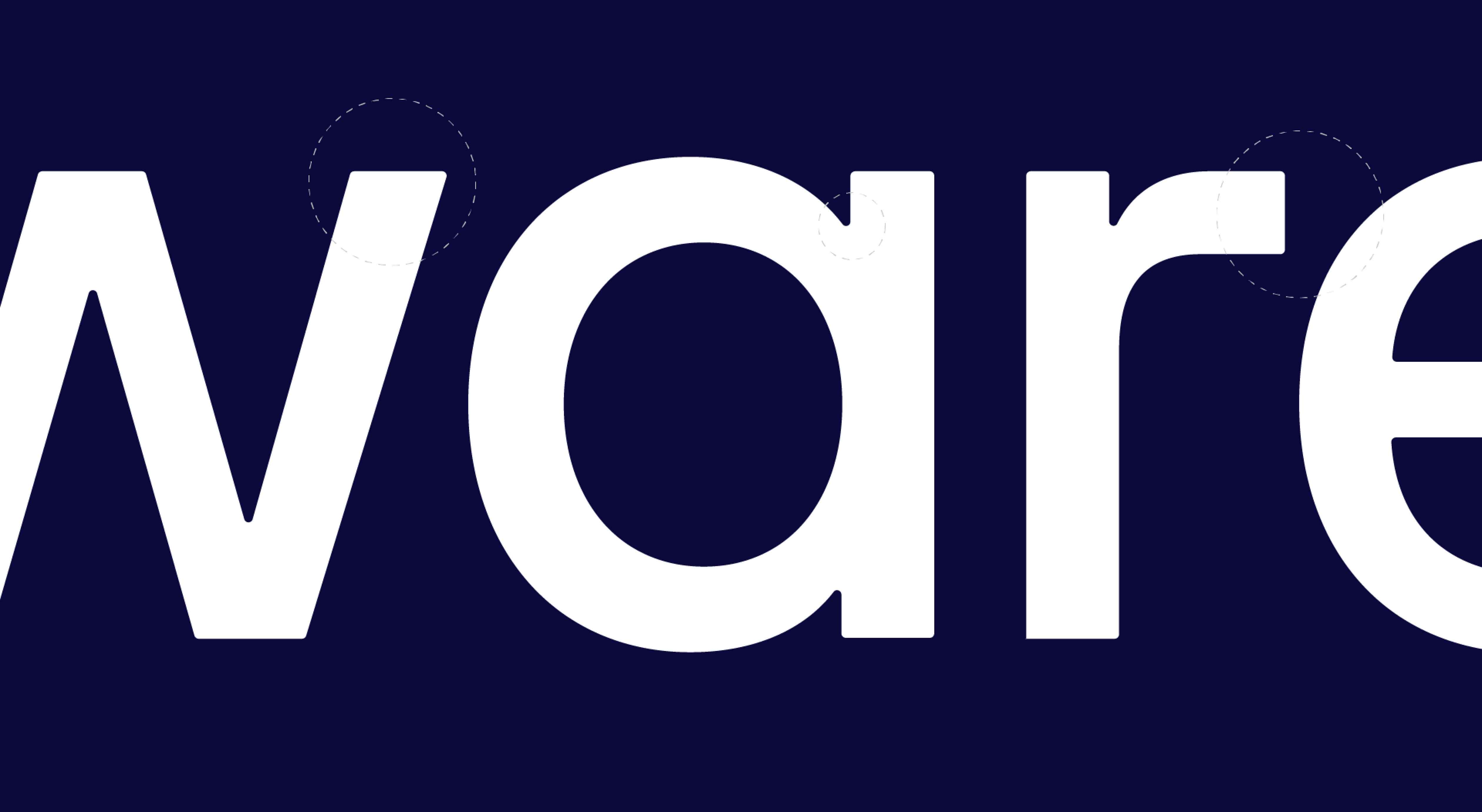
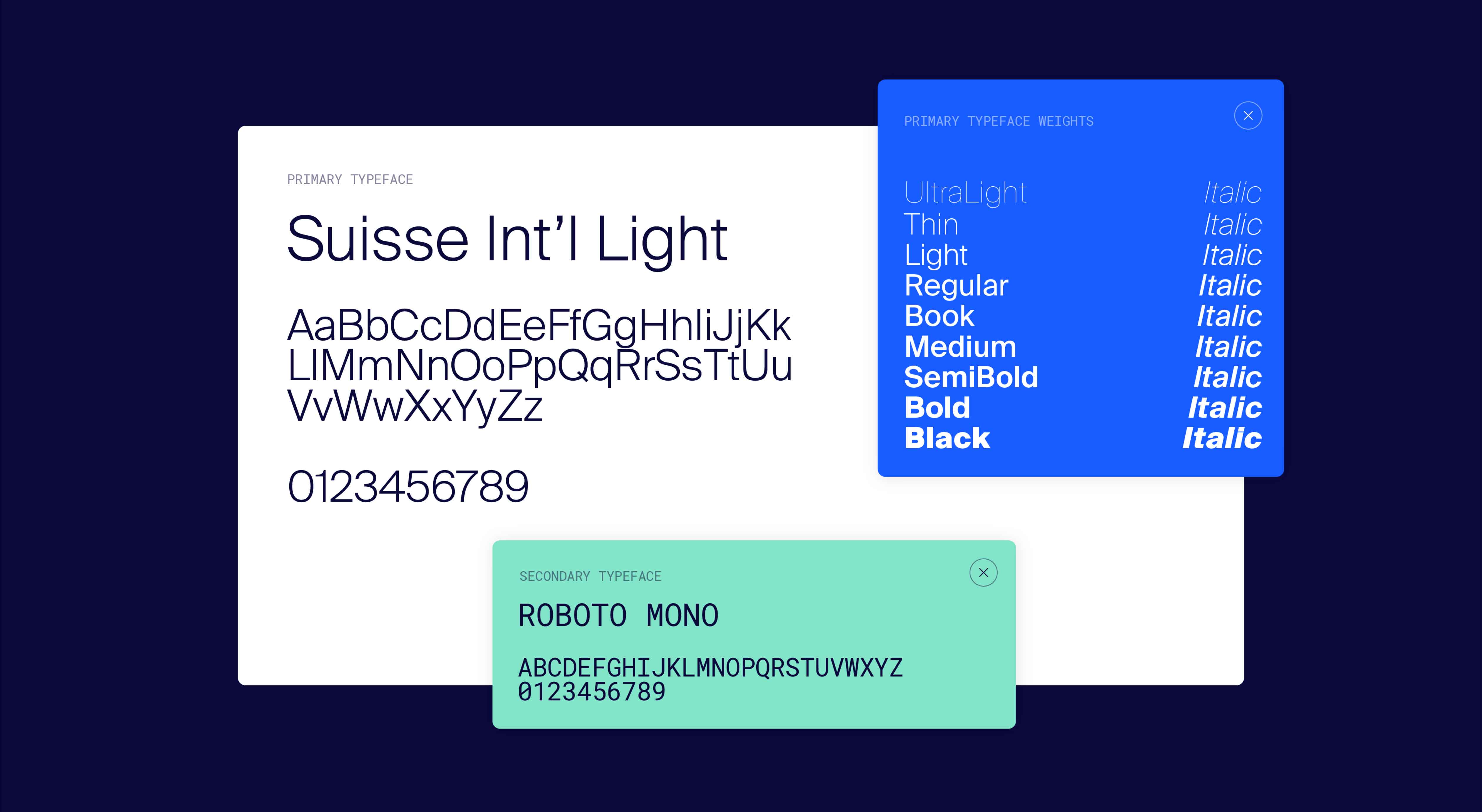
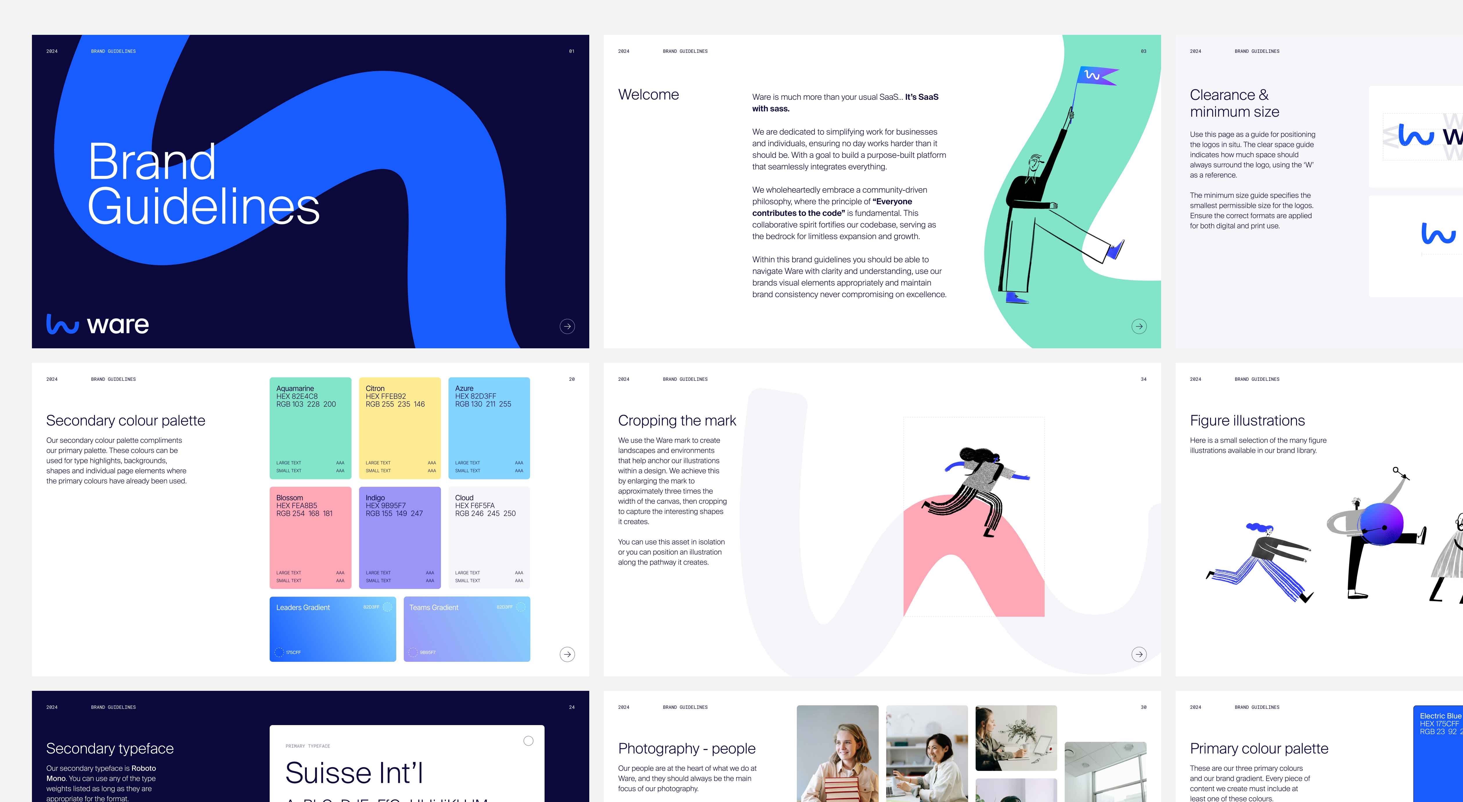
We began with the typography. Bricolage Grotesque emerged as the right fit — a playful evolution of their original typeface, bringing character and warmth without tipping into informality. Applied in lighter weights and restricted to short headlines, it punctuates rather than dominates. A voice that feels distinctive but controlled.
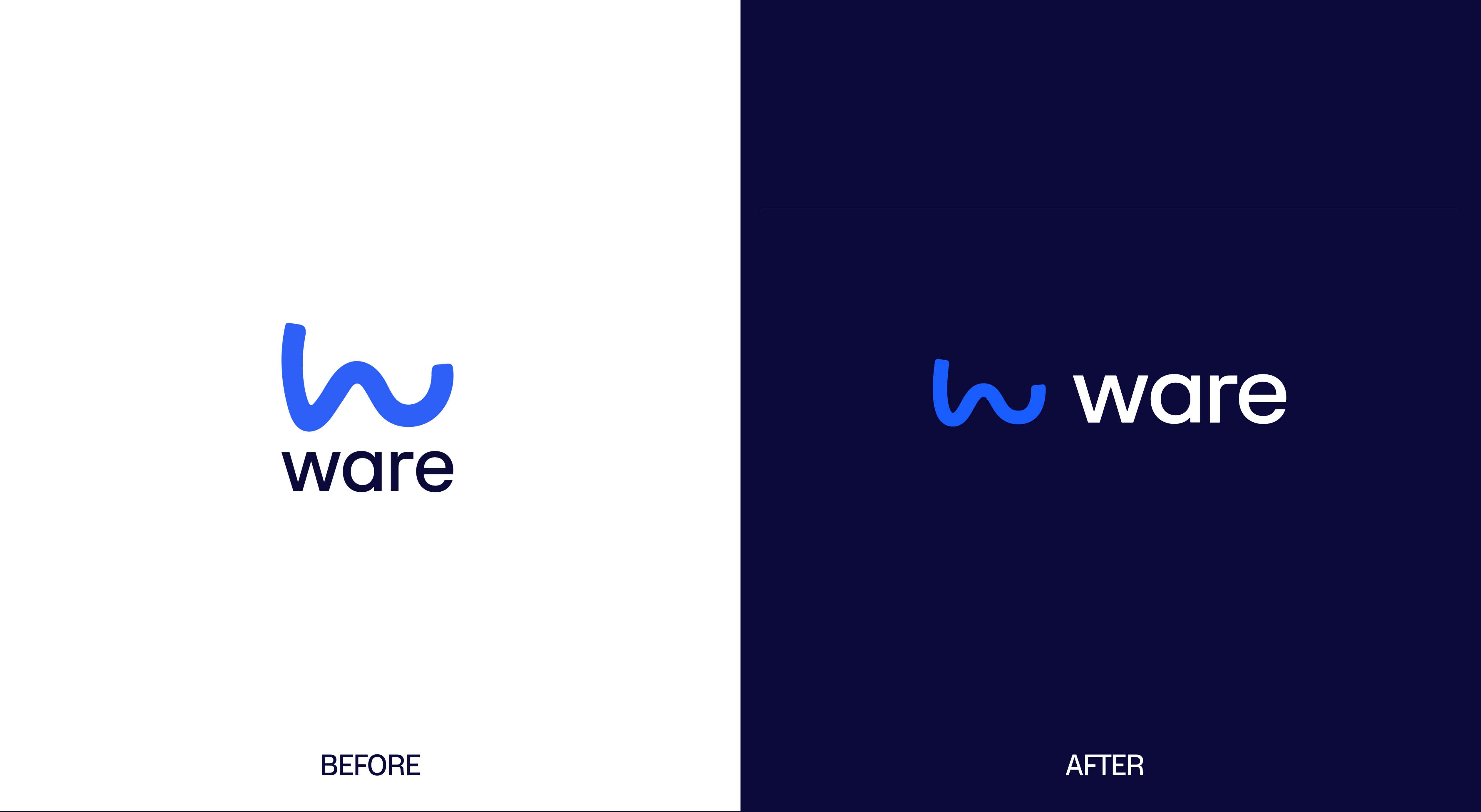
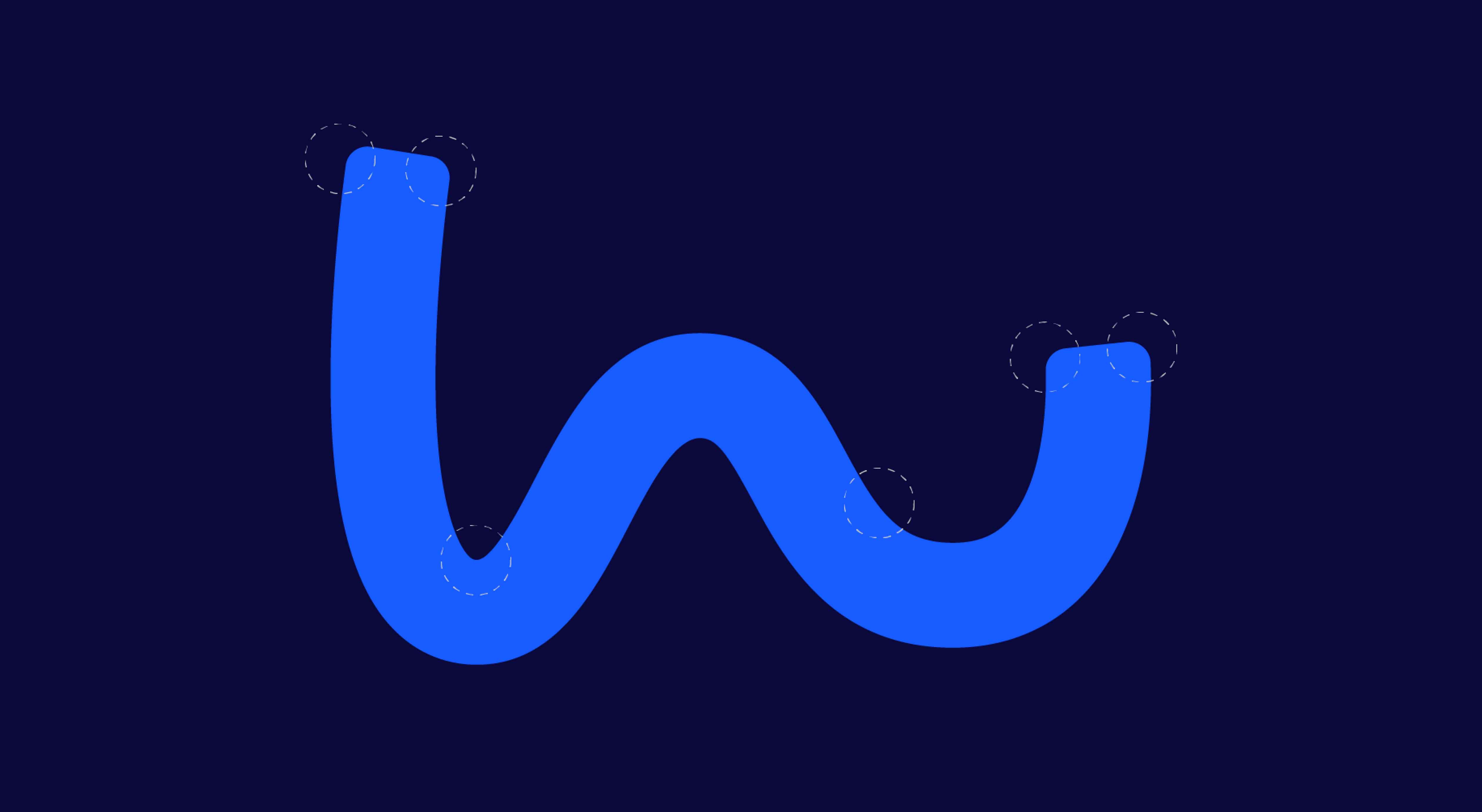
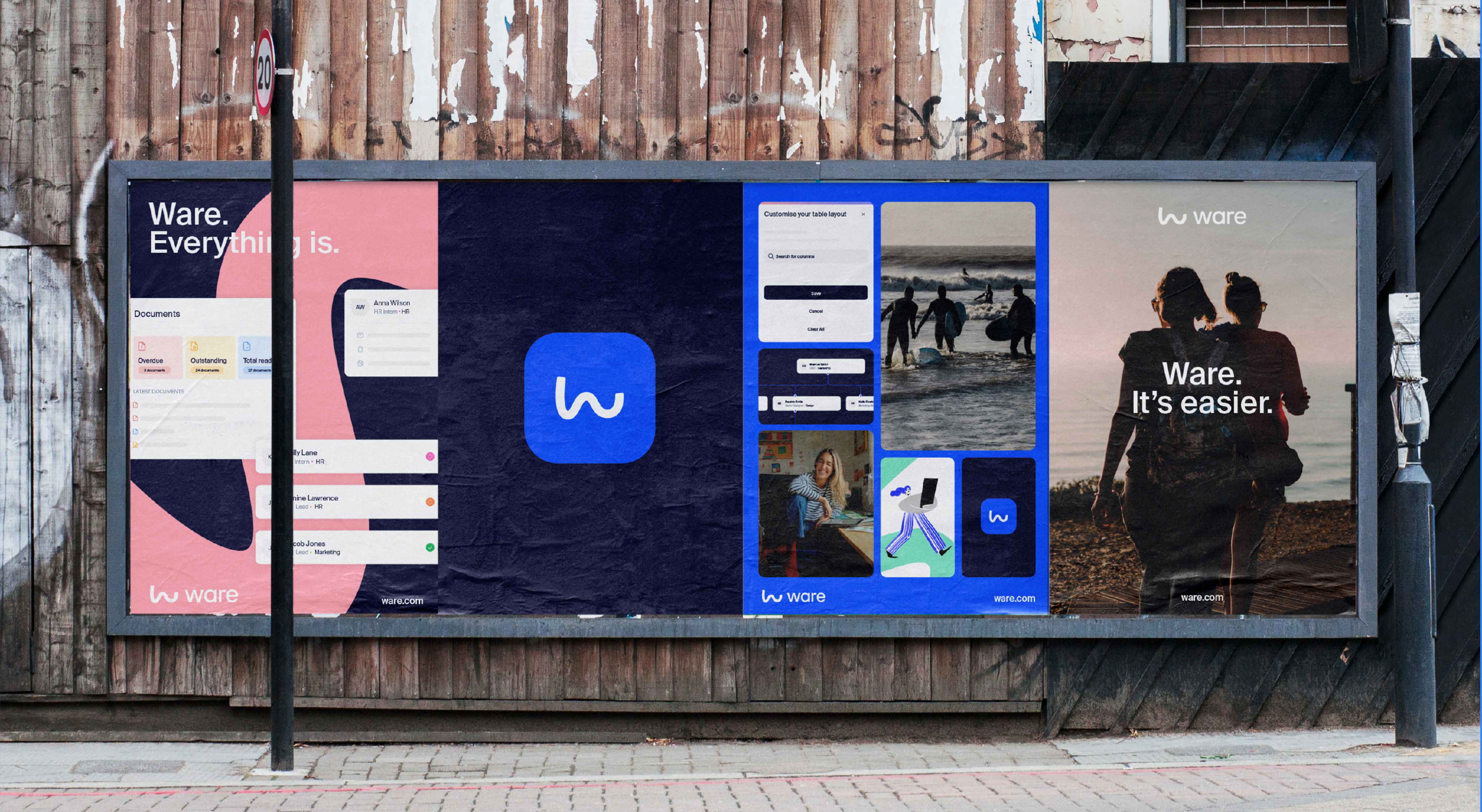
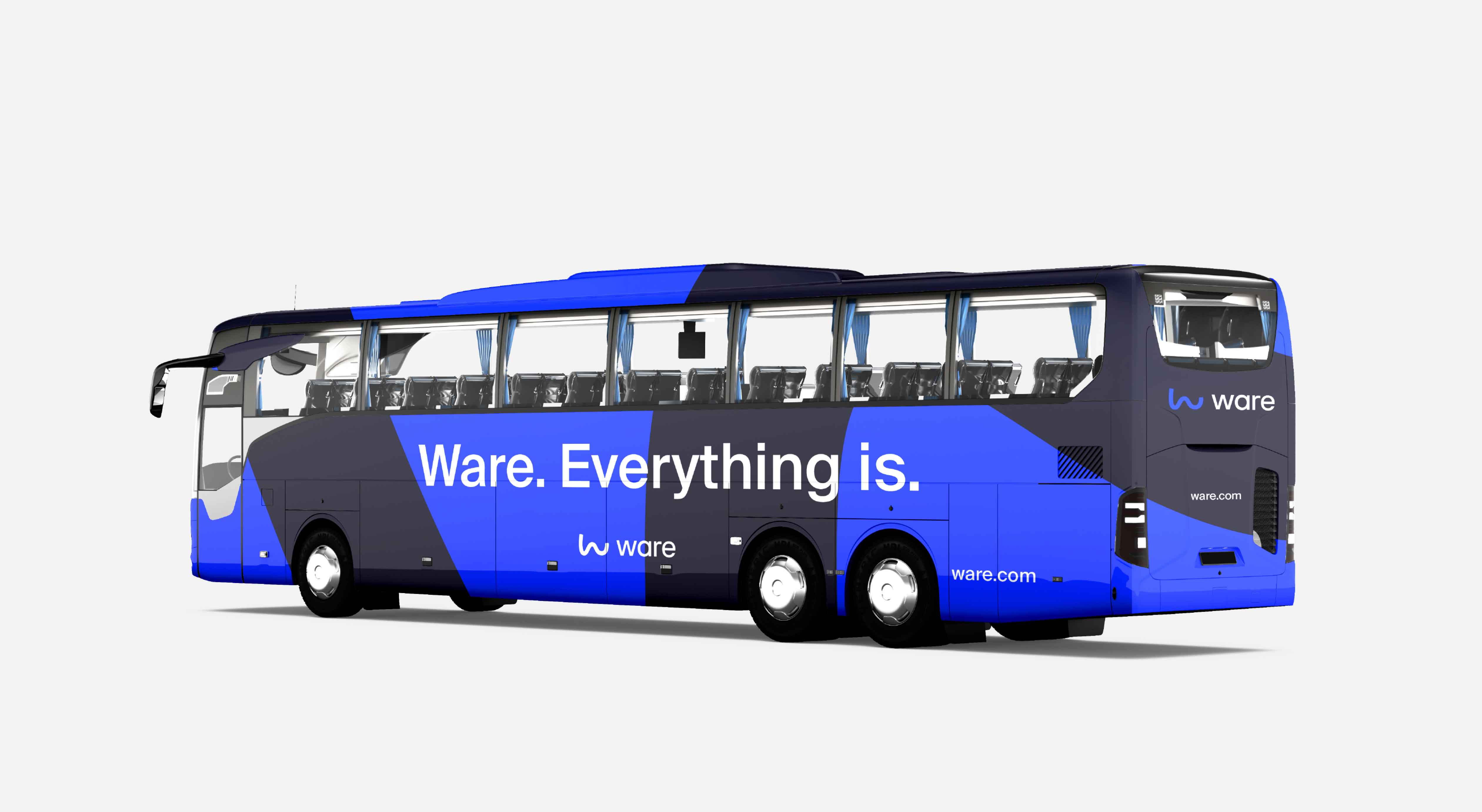
The logo was refined rather than reworked. Softening the corners of the 'W' wordmark created a more cohesive relationship with the wave symbol — a form that already carried the brand's spirit: fluid, rounded, in motion. From that same mark, we developed a pattern system: the logo extracted, scaled and repeated to generate organic shapes and forms that could hold and house other graphic elements across the brand world. Used at scale, the wave stops being a logo and becomes an environment — giving the visual system depth, flexibility and a sense of space that a wordmark alone could never provide.
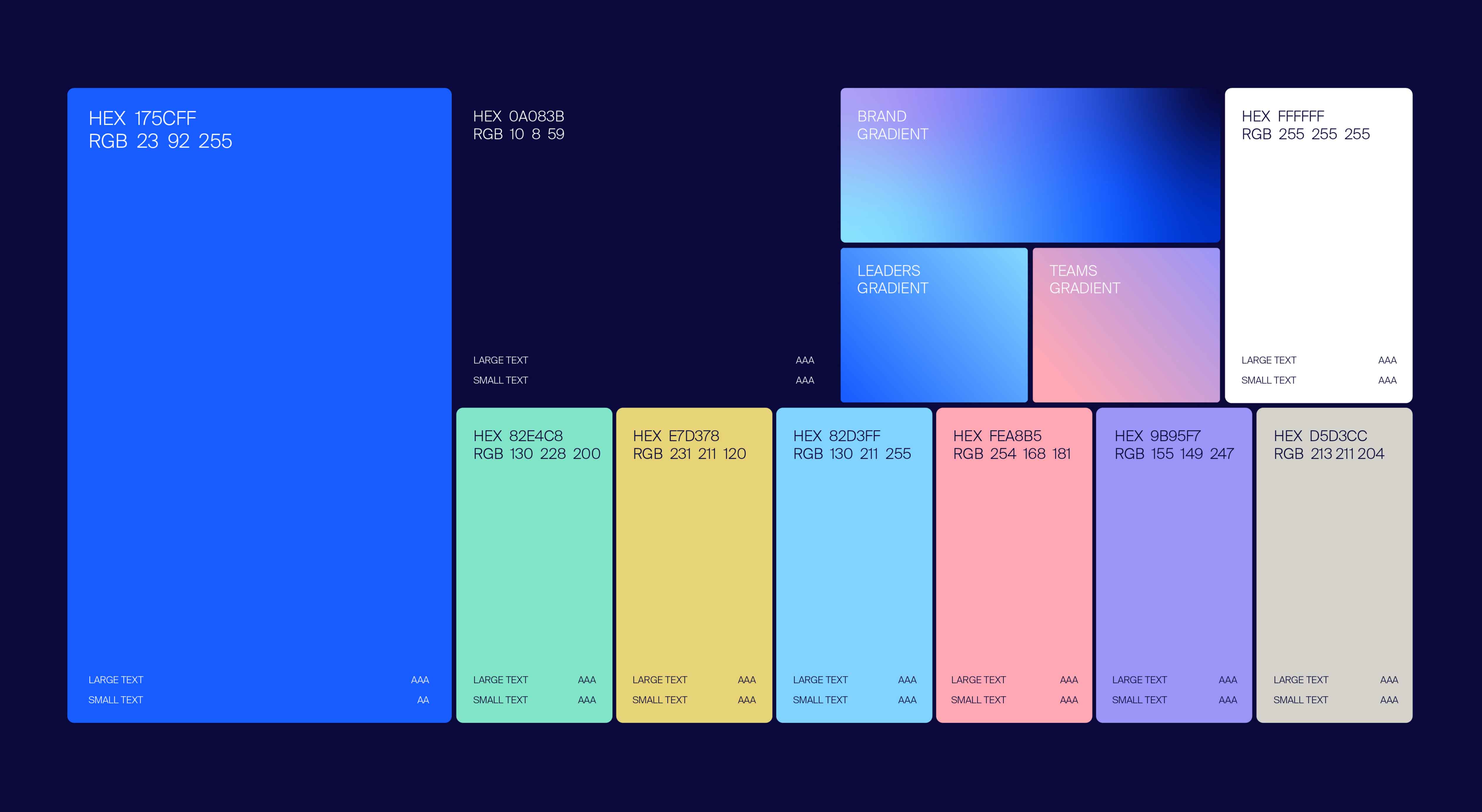
The gradient — already part of Ware's DNA — was recalibrated: the pinks pulled back, the blues brought forward, the overall palette lightened and freshened. Used as a subtle accent within UI elements, it ties brand and product together in a way that feels designed from the inside out.
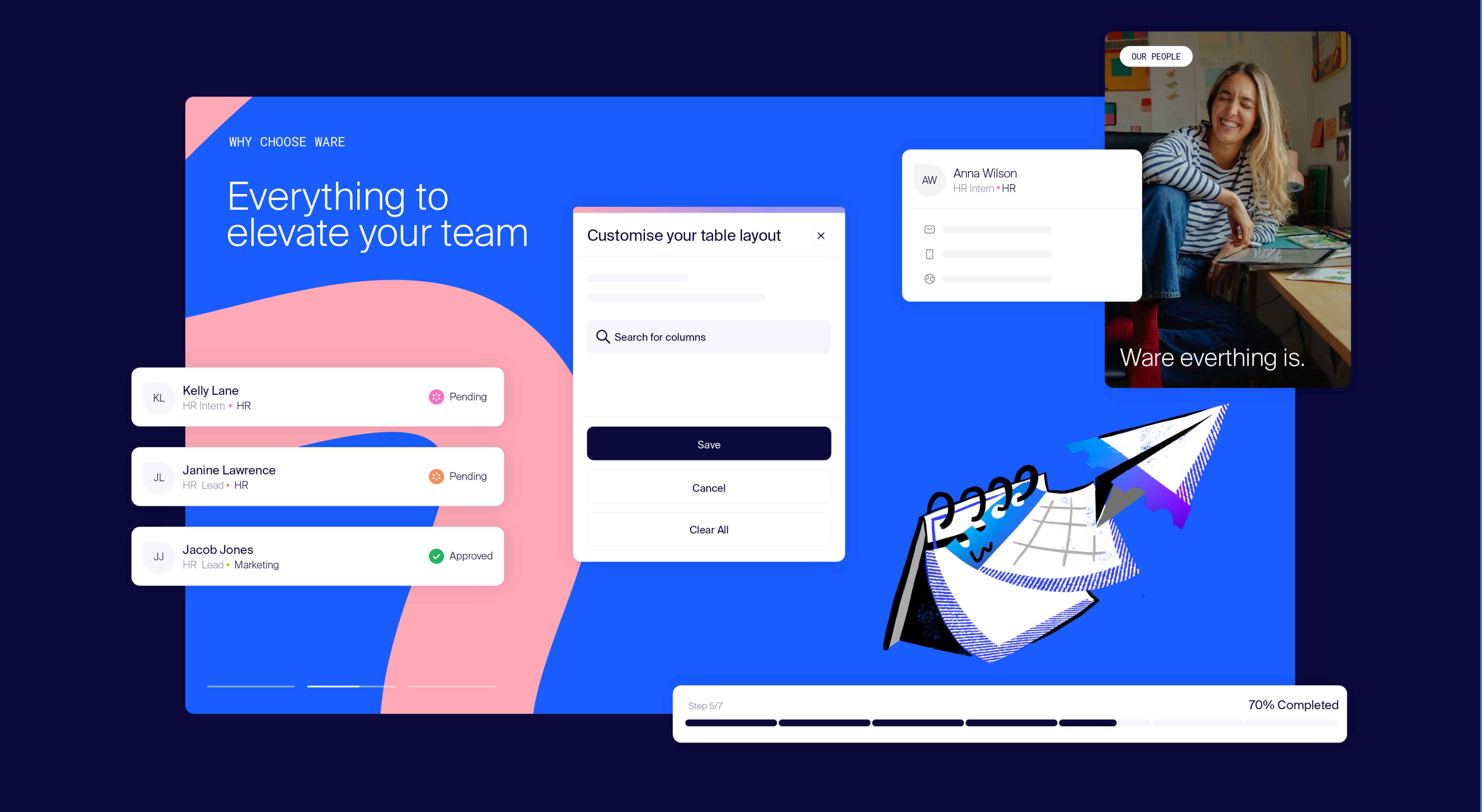
Ware's illustration suite was preserved and integrated rather than replaced. Placed with intention across content-heavy layouts, the illustrations do the job illustrations do best — breaking the weight of information, injecting moments of joy, and reminding the reader that there are real people behind the platform. Handled carefully, they add levity without undermining credibility.
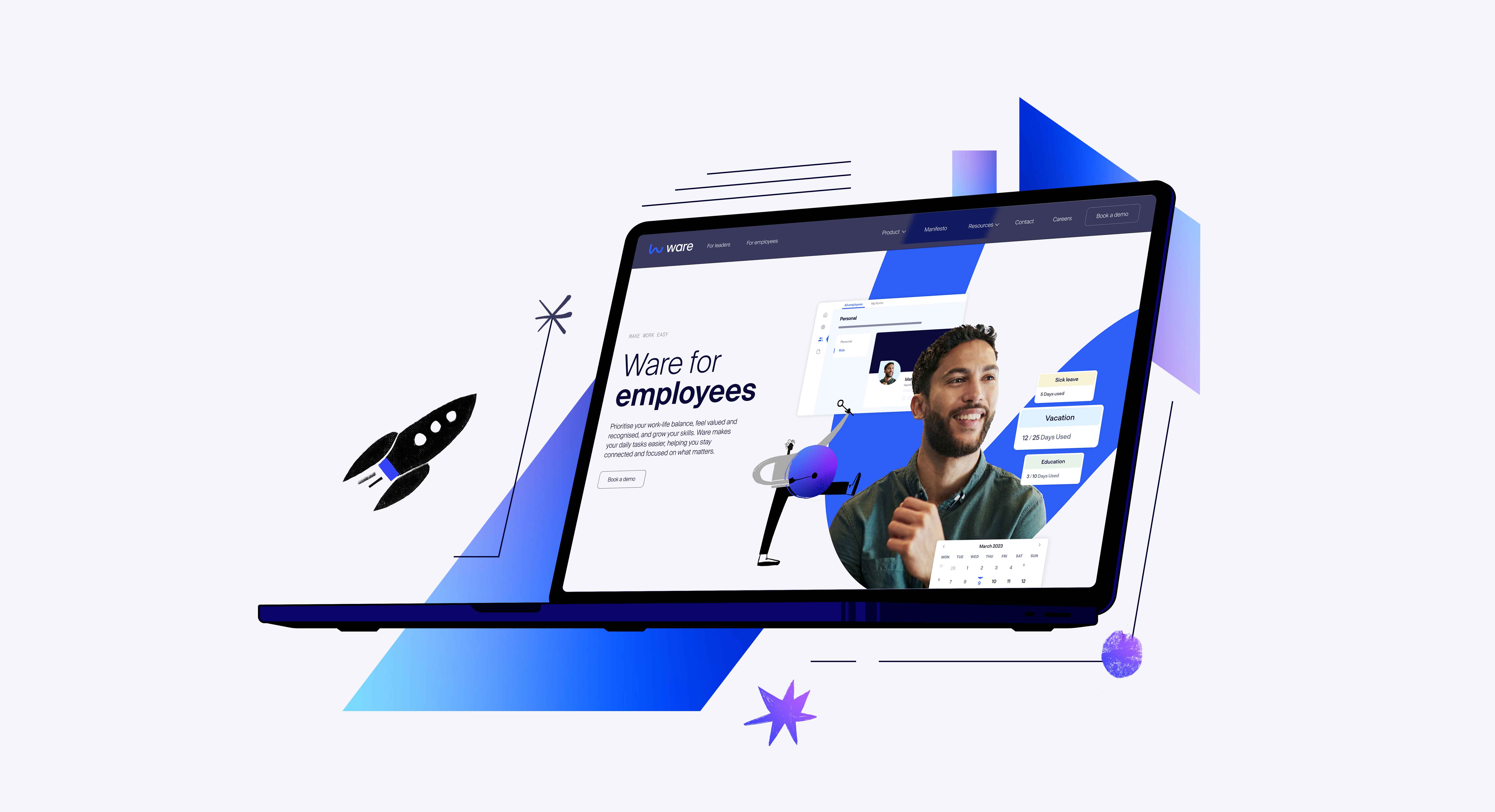
On the website, onboarding was treated as the centrepiece of the user journey. Simplified product animations and feature highlights walk both employees and employers through the platform in a way that feels intuitive and immediate — showing what Ware does rather than asking visitors to take it on trust. The experience is designed to turn understanding into confidence, and to ultimately convert new customers.
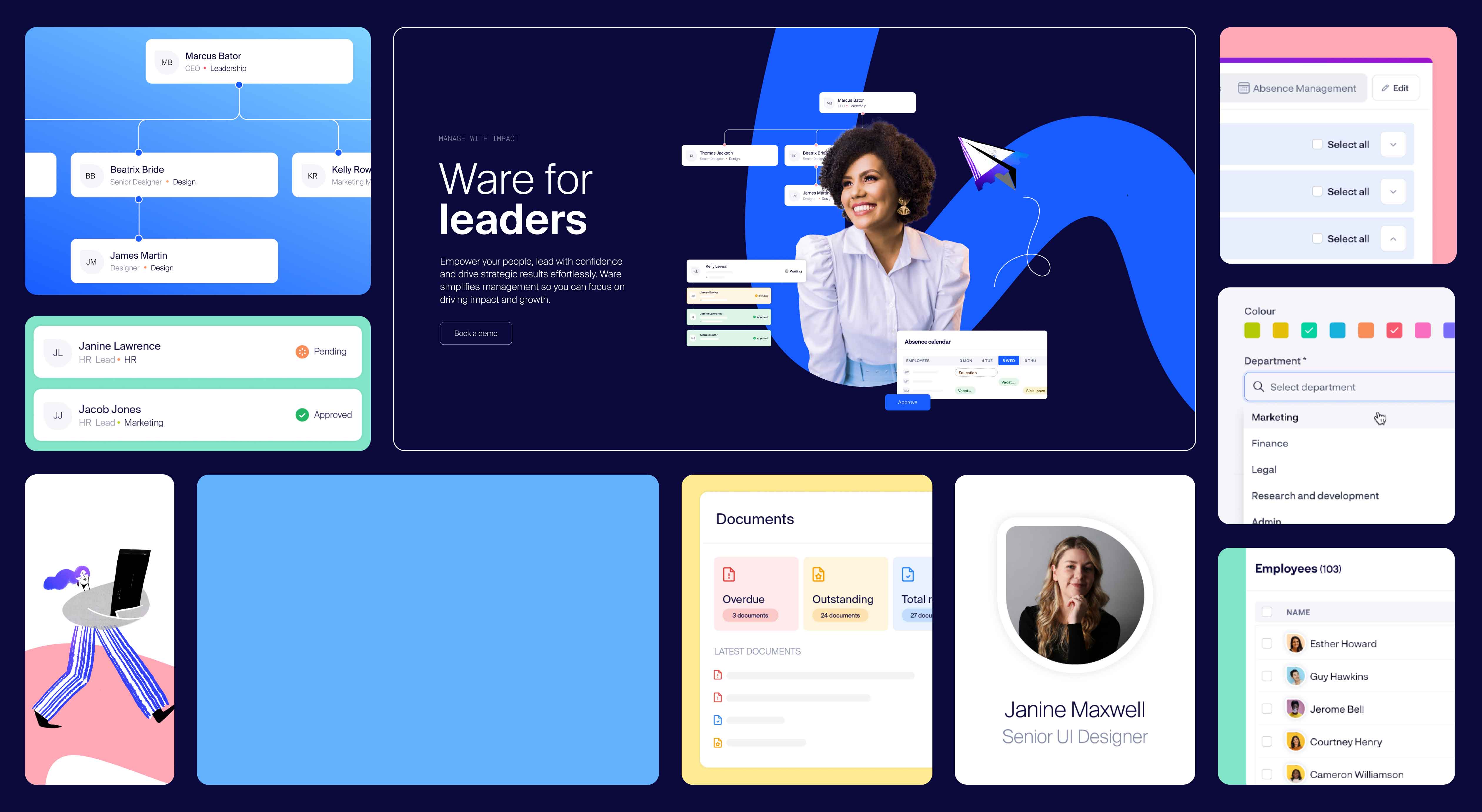
Underpinning it all is a modern, refined UI system built to elevate the brand at its most important touchpoint. For a platform like Ware, the website is often the first impression a person has of the brand itself — not an advert, not a social post, but the actual thing. Getting that right mattered. The result is a system that feels coherent, considered and unmistakably Ware: sophisticated enough to earn trust, human enough to keep it.