The Client
Noughts & Ones is a specialist Shopify consultancy helping ambitious ecommerce brands cut through the noise and make better decisions. Founded by Tom Locke — with a decade of running a Shopify agency behind him — they offer the kind of independent, informed perspective that most brands never get. Whether shortlisting the right agency partner or stepping in as a fractional ecommerce director, Noughts & Ones exist to give scaling brands the clarity, strategy, and leadership they need to move forward with confidence.
The Challenge
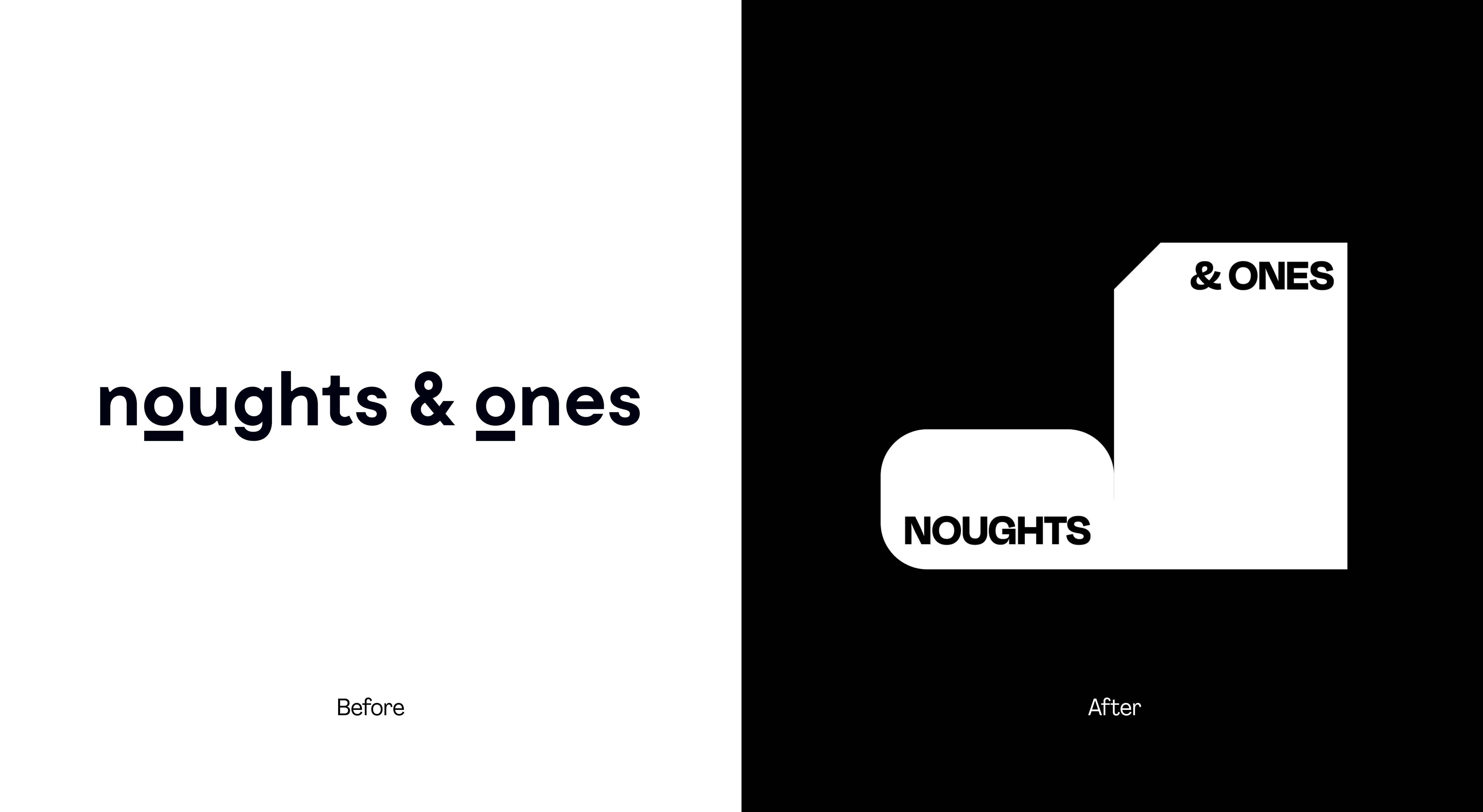
Noughts & Ones had a clear strategy, a confident point of view, and a genuine point of difference. What they lacked was a brand that could articulate it. Their previous brand hadn't been touched for nearly a decade, leaving the visual language disconnected from the maturity of the business it was meant to represent. Their approach — considered, principle-led, always in service of the right outcome — was evident in their advice. It just wasn't yet visible in the brand.
The challenge was to create an identity that matched the clarity of their thinking: one that felt credible and consultancy-grade, scaled across client materials and digital platforms, and stood apart from a Shopify landscape where most players look and sound almost identical.
The Process
We began with a deep strategic immersion — reviewing Noughts & Ones' existing brand framework, their competitive landscape, and the real experience of their clients. The Shopify consultancy space is congested and largely undifferentiated; the opportunity was clear. This wasn't a brand that needed to be louder. It needed to be sharper.
Our creative springboard — Built on purpose — shaped everything that followed. A brand defined by deliberate choices, where clarity and confidence emerge from focus rather than noise. From there, we explored how that idea could be expressed visually, moving through territories that drew on natural geometry, modular systems, and the elegance of binary thinking.
The concept that emerged — Changing States — took its cue from the name itself. In binary, 0 and 1 represent two opposing states: inactive and active, uncertain and decided. For Noughts & Ones, that tension is the whole business. Their clients arrive unclear — unsure which direction to take, which partner to trust, which decision to make next. Noughts & Ones are the catalyst. The thing that flips the switch from hesitation to momentum, from the wrong move to the right one.
The Solution
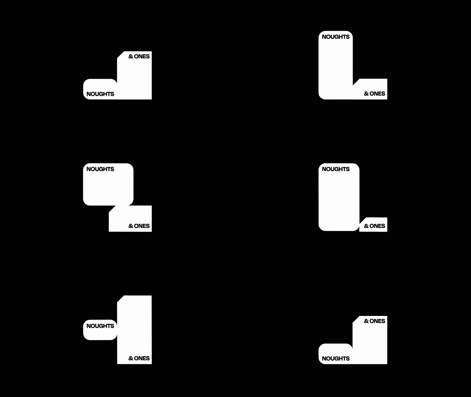
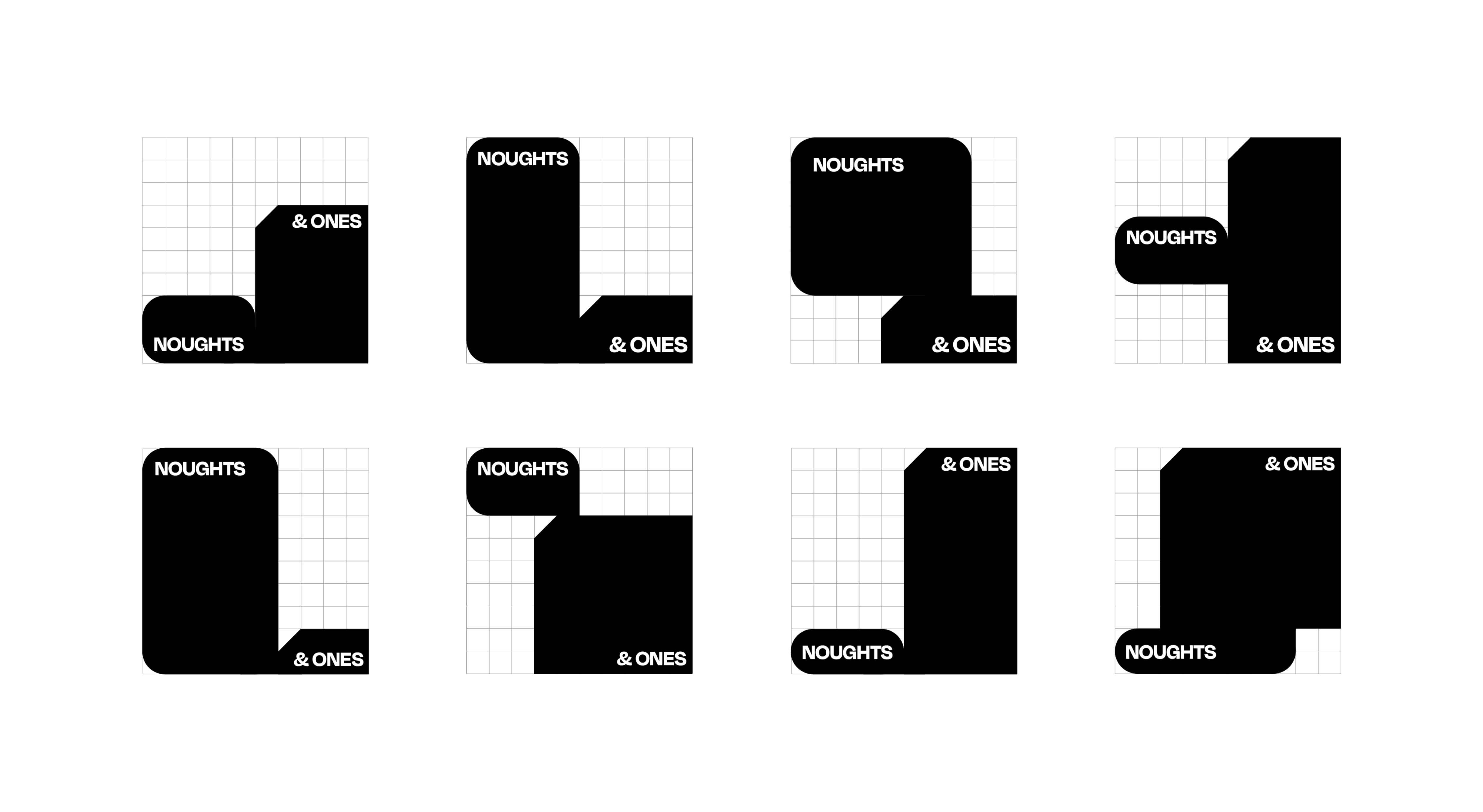
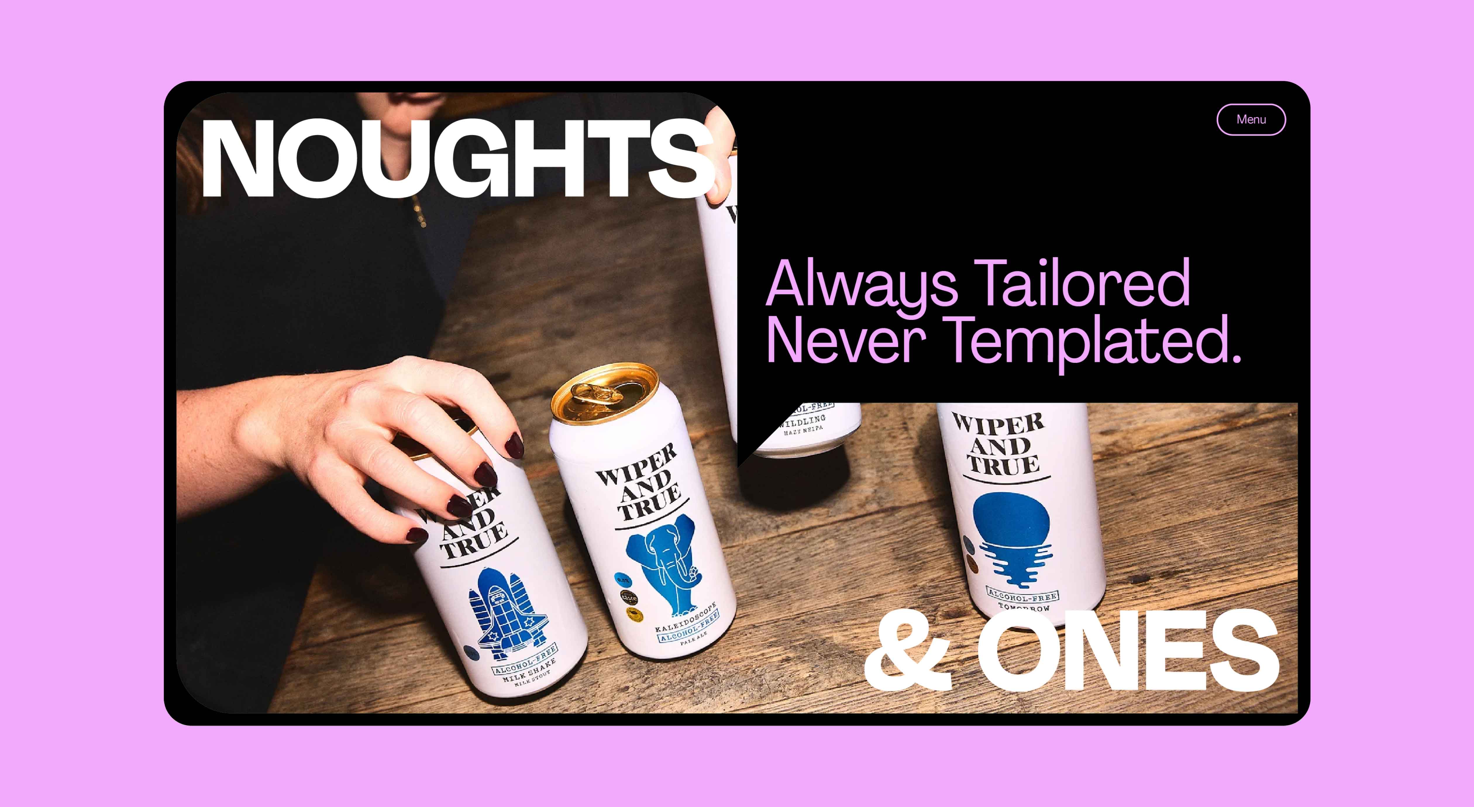
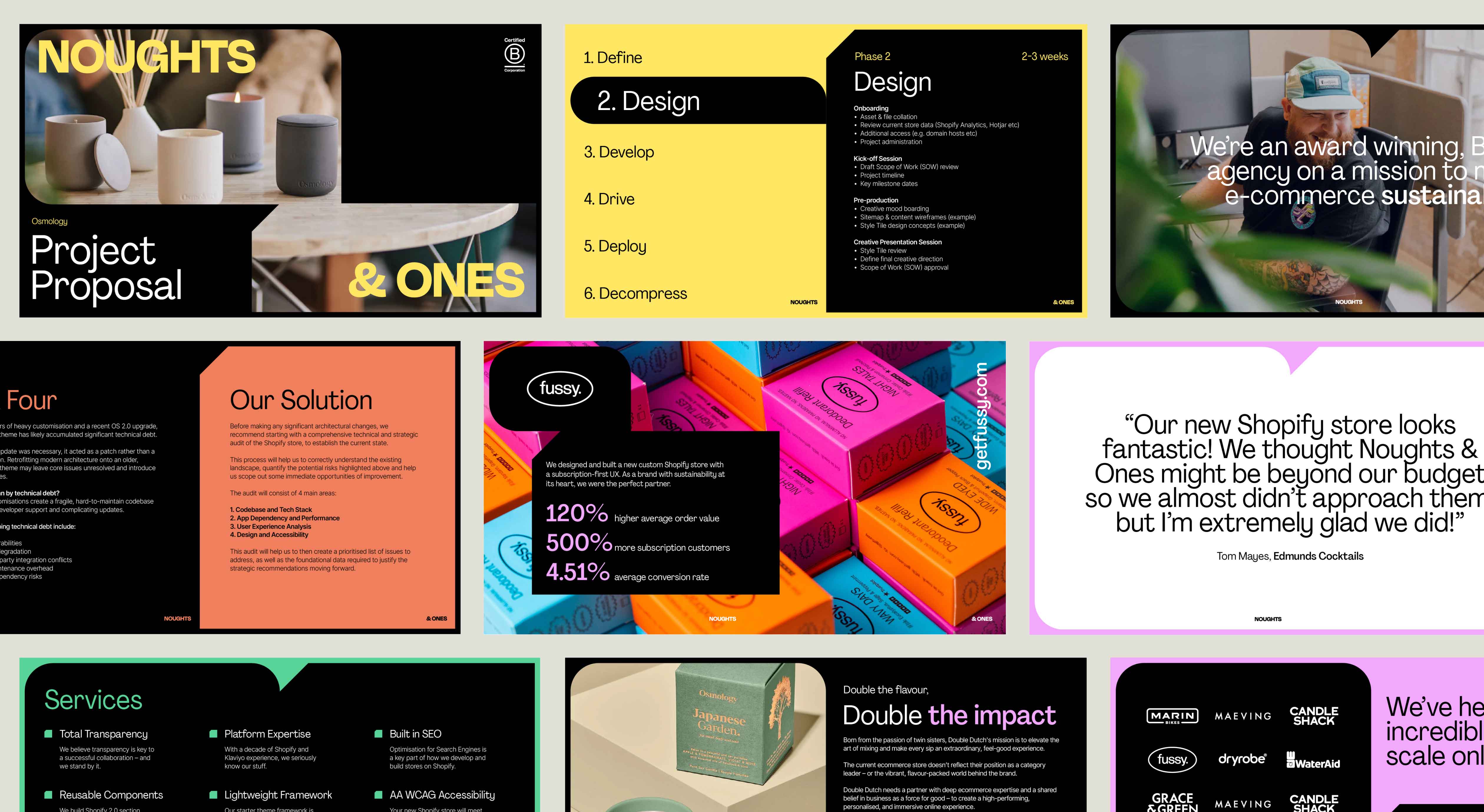
The final identity is built around the idea of cause and effect — the moment a switch is flipped and something changes state. The visual system uses the tension between binary opposites as its foundation: before and after, unclear and decided, passive and in motion. Every element reflects the same principle-led thinking that defines how Noughts & Ones advise: nothing arbitrary, everything intentional.
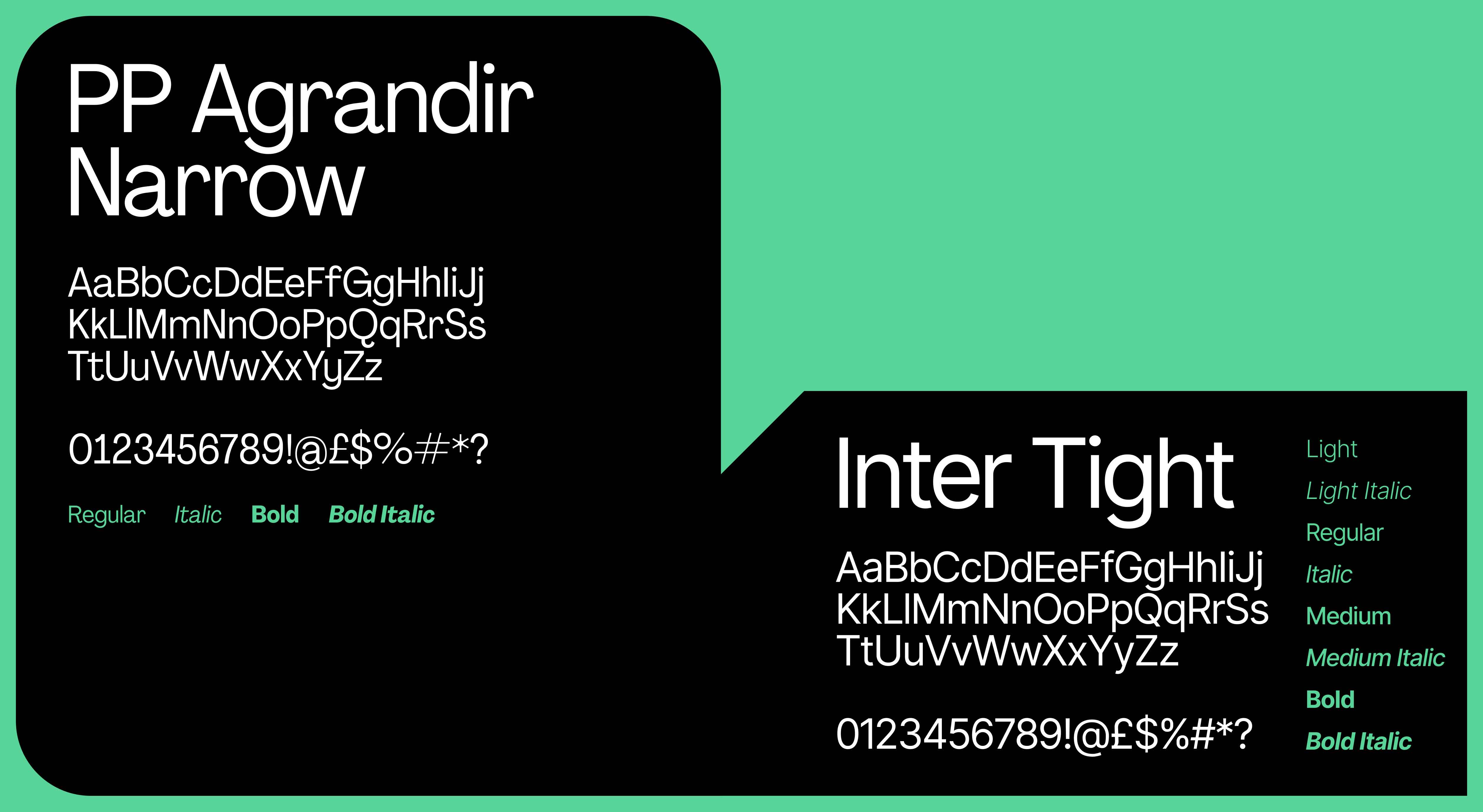
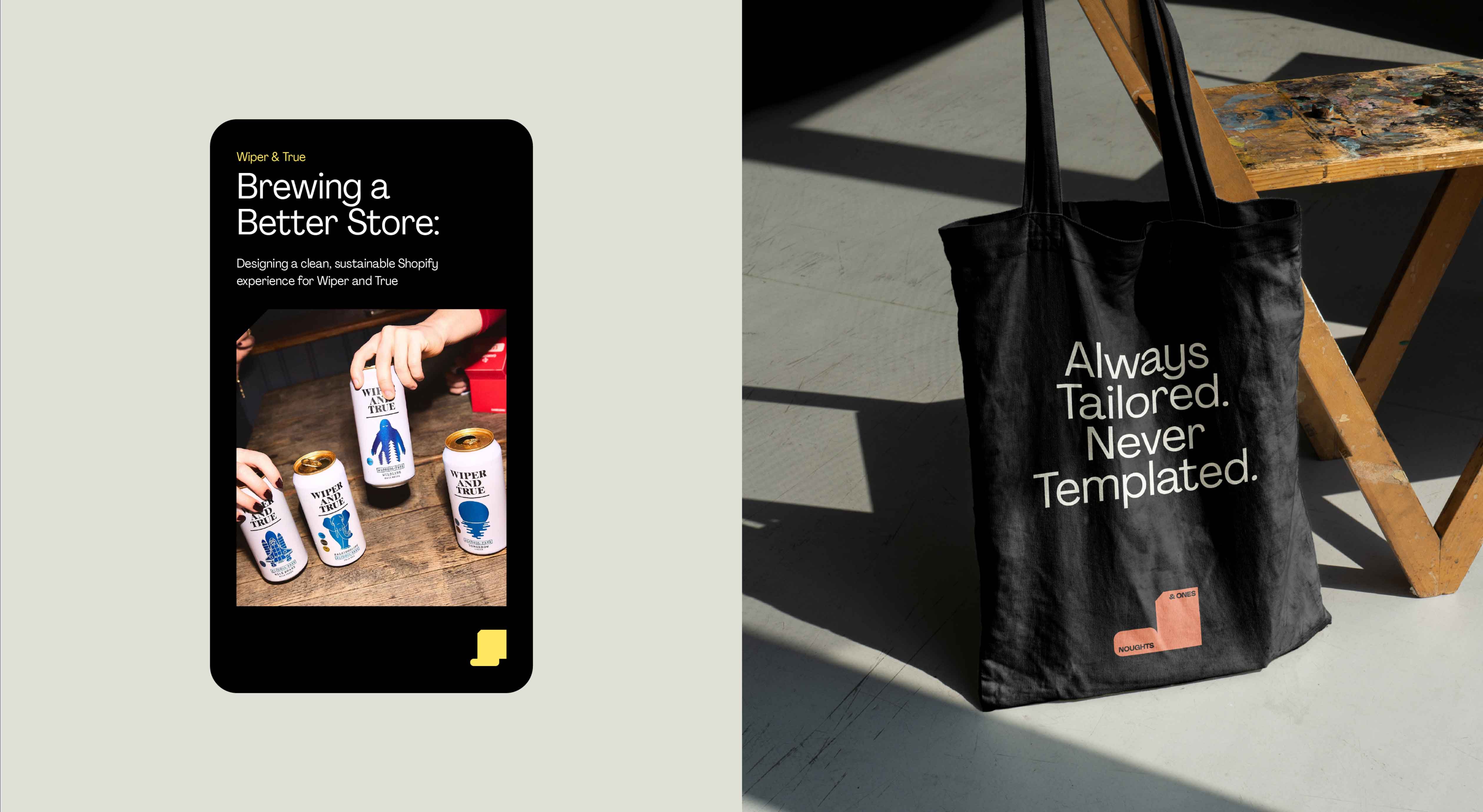
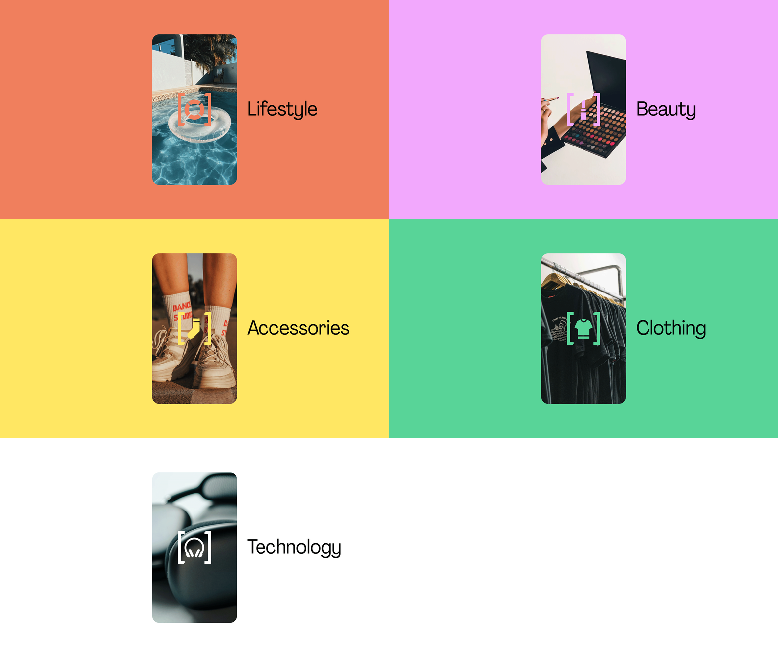
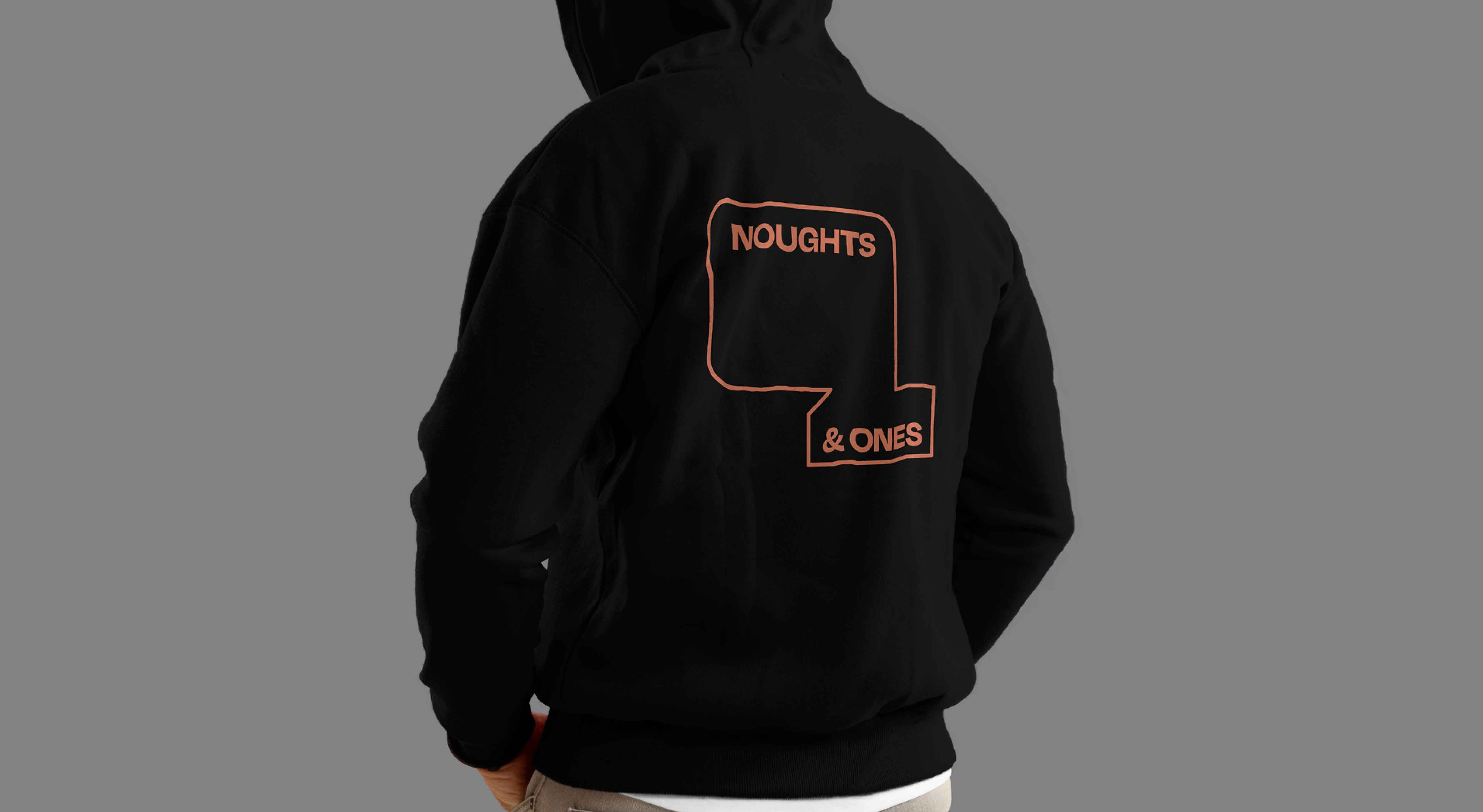
The system scales across a flexible set of assets — logo, typography, colour, pattern, iconography, and photography direction — all calibrated to feel as authoritative in a boardroom presentation as they do on a LinkedIn post. Confident without being loud. Structured, but never rigid. A moving, evolving brand that earns its credibility the same way Noughts & Ones do: through the quality of its thinking.