The Client
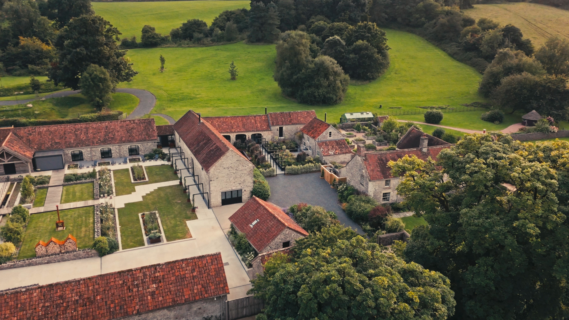
Nestled in the rolling Mendip hills, Everards Farm is an exclusive retreat designed for rest, reconnection and meaningful celebration. It’s a place where simplicity feels luxurious, where nature frames every experience, and where moments are created to be remembered long after guests leave.
More than a destination, Everards Farm offers a sense of sanctuary. Every detail, from the landscape to the interiors, has been carefully considered to create an atmosphere that invites guests to slow down, reconnect and feel completely at home.
The Challenge
While Everards Farm offered an exceptional experience, the brand lacked clarity and cohesion. They knew the feeling they wanted to create, but struggled to clearly articulate what they stood for, who they were for, and how to express the value of their offer with confidence and consistency.
Before evolving the visual identity, we needed to build a stronger strategic foundation. This meant defining their brand manifesto, sharpening their positioning, developing a distinct tone of voice and messaging guidelines, and crafting an updated tagline that captured the essence of Everards Farm. Only then could the brand fully reflect the depth, care and intention behind the experience itself.
The Process
We began by immersing ourselves in the Everards Farm experience, understanding what it feels like to arrive through the gates, explore the grounds, and settle into the rhythm of the place. A clear theme emerged: Everards Farm is an oasis, a pause from the outside world, where thoughtful design quietly supports moments of connection and celebration.
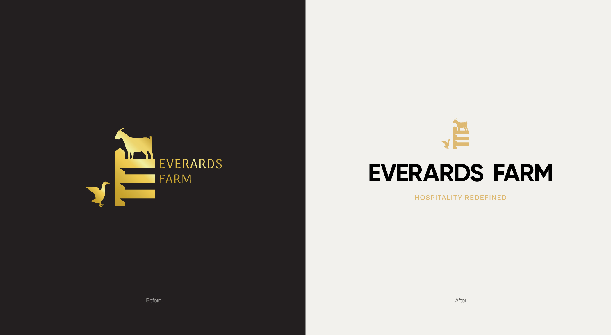
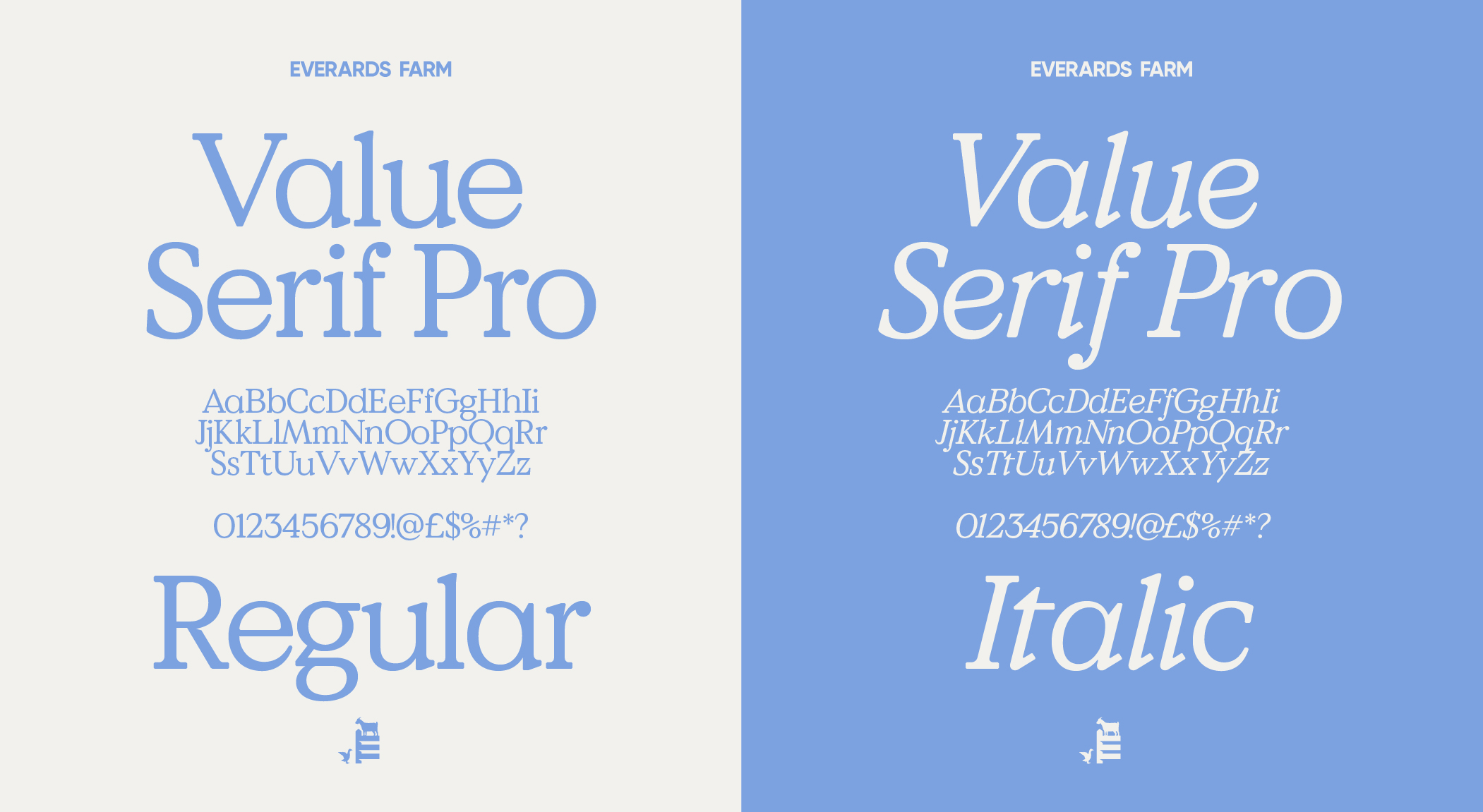
Rather than reinventing the brand, we focused on refinement. We explored how typography, colour and imagery could work together to elevate the existing identity, bringing clarity, consistency and a sense of quiet confidence across every touchpoint.
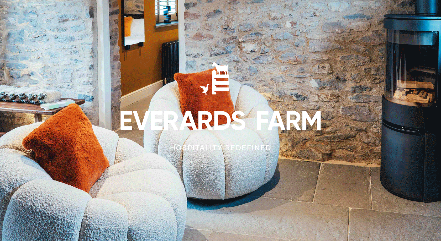
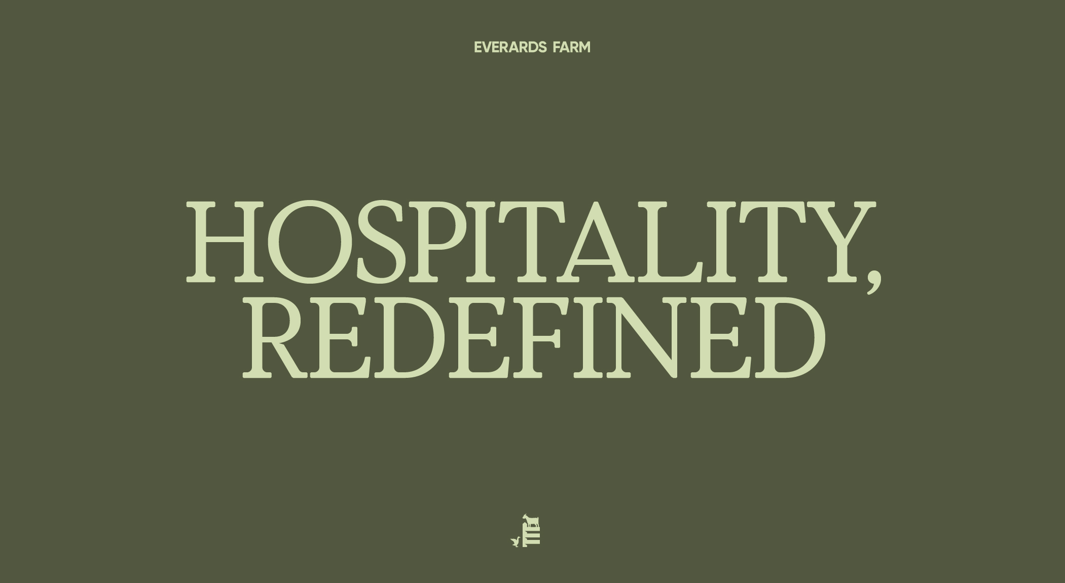
The Solution
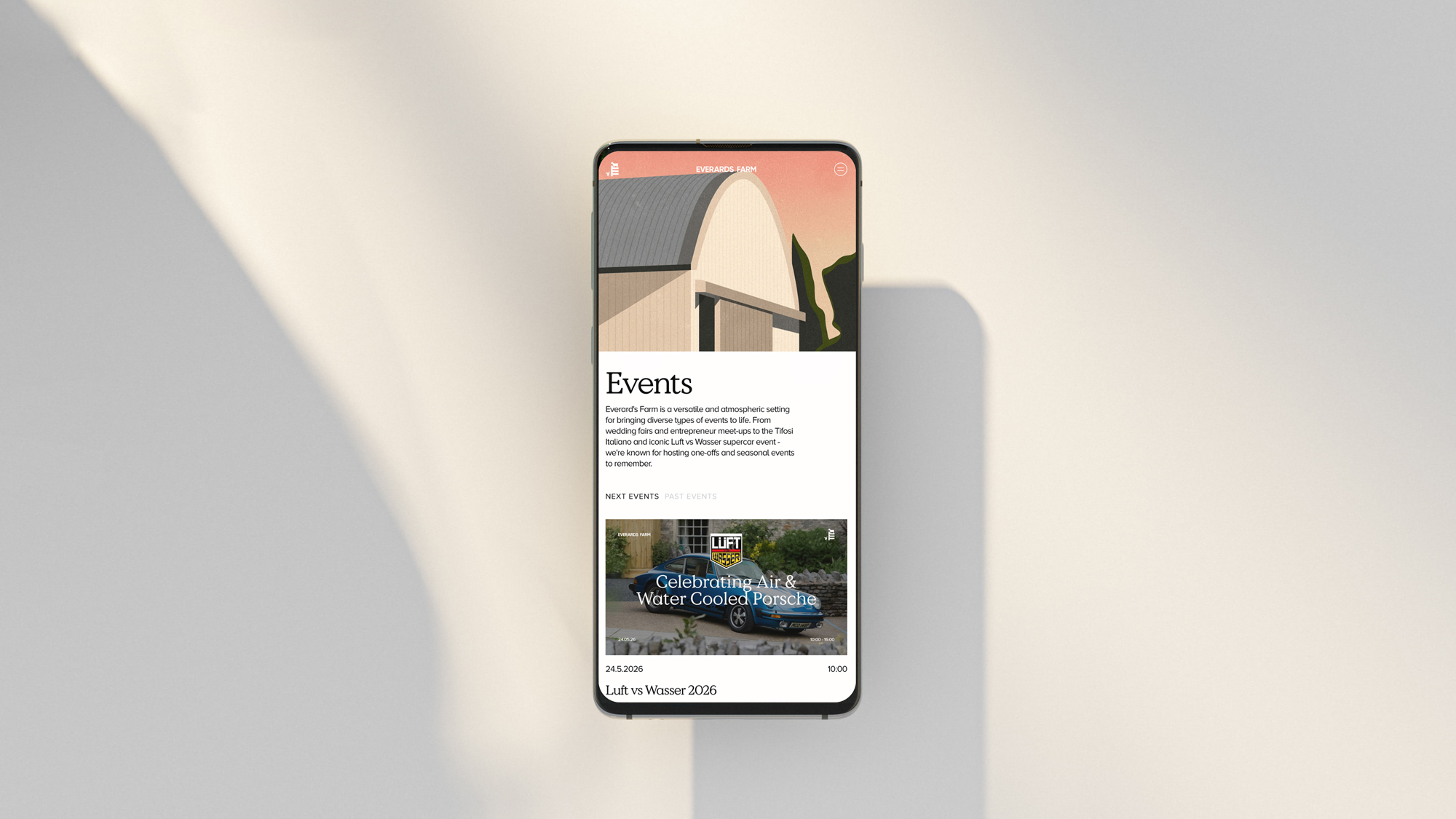
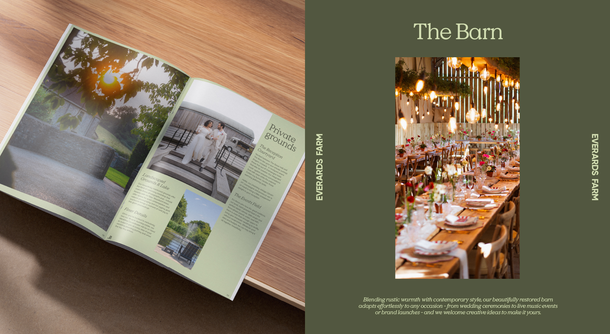
The refreshed Everards Farm identity balances elegant, confident typography with expressive, atmospheric photography. The typography brings structure and refinement, while the imagery showcases Everards Farm as a backdrop for memory-making, from intimate moments to larger celebrations.
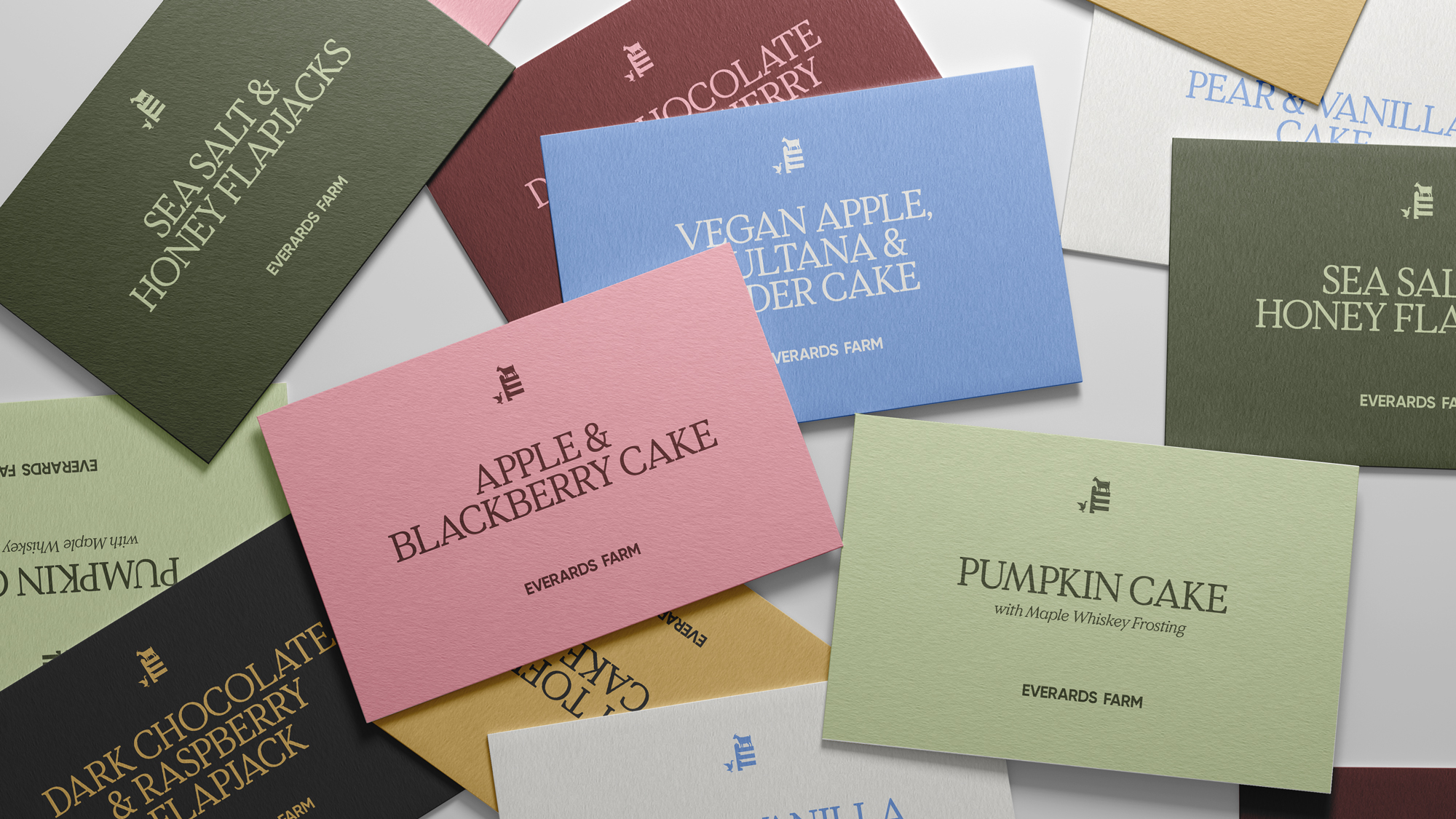
Drawing directly from the environment, we curated a bespoke colour palette inspired by the textures and tones found throughout the Farm. Hues reference natural materials used across the site, alongside softer shades lifted from the surrounding landscape and overflowing gardens. This palette allows the brand to live comfortably in digital spaces, while remaining rooted in its physical setting.
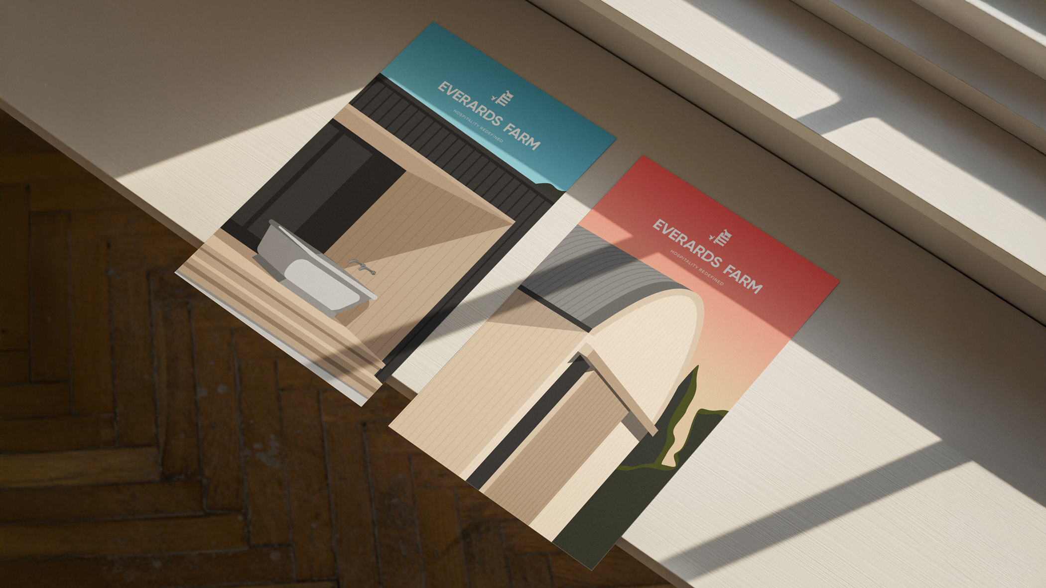
To further enrich the identity, we created a bespoke suite of Art Deco-inspired illustrations. These pared-back line drawings capture key areas of the Farm in their simplest forms, distilling architectural details and landscape features into elegant, timeless motifs.
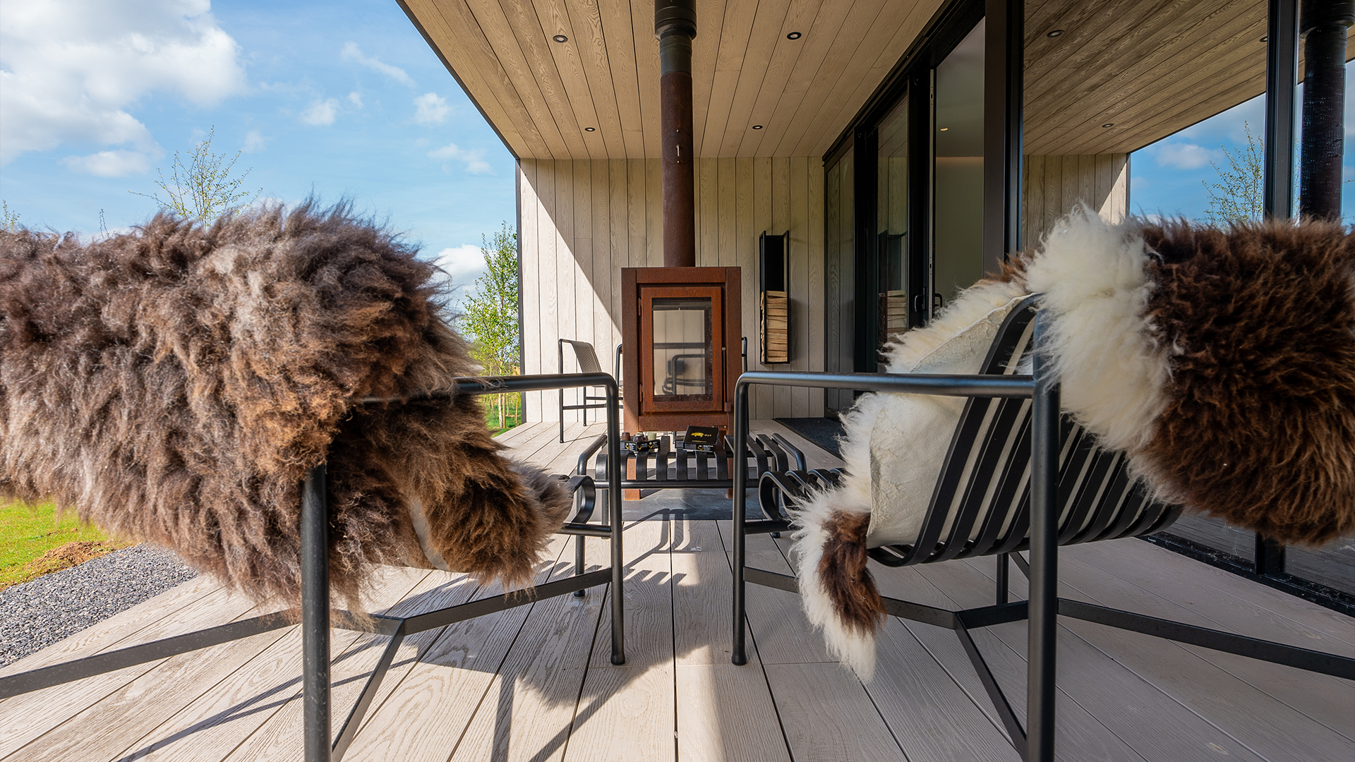
Alongside the illustration suite, we developed an updated bank of photography and video to support the brand across digital marketing channels. The visual direction focused on light, texture and atmosphere, capturing both the grandeur of the setting and the intimacy of individual moments. From sweeping views of the Mendip hills to close, tactile details, the content reflects the balance of scale and simplicity that defines the Everards Farm experience.
To ensure consistency beyond launch, we created clear social media guidelines and activation principles. These outlined how the refreshed brand should show up across platforms, from tone of voice and caption style to layout treatments and content themes. The result is a cohesive digital presence that feels as considered as the Farm itself, allowing Everards Farm to tell its story with clarity, confidence and warmth.
Our work with Everards Farm continues as we support their wider brand and marketing strategy, helping to grow their community, increase bookings and successfully launch their wedding offering. Together, we’re building a brand that not only reflects the beauty of the Farm, but actively drives its next chapter of growth.


.webp)
.gif)


