The Client
Warren Partners is a board and executive search firm with a genuine difference. Employee-owned, diversity-committed, and trusted by some of the UK's most respected businesses, they've spent years quietly building a reputation that far outstrips their visibility. Their work shapes boardrooms. Their brand didn't reflect that.
The Challenge
In a market crowded with cold, corporate, and largely indistinguishable competitors, Warren Partners had a problem most firms would envy: they were better than their brand suggested. Loyal clients knew it. New prospects didn't. The brief was to close that gap, creating a brand that championed their diversity and sustainability credentials, reflected their employee-owned culture, and gave them the confidence to pursue larger opportunities without alienating the clients who already loved them.
The challenge wasn't starting from scratch. It was translating something exceptional into something visible.
The Process
We began where we always do, with the people inside the business. Workshops with the Warren Partners team surfaced a brand with real conviction: courageous, ethical, inclusive, and deeply personal in how they work. The phrase that kept coming up was "the best-kept secret in board and executive search." It was said with pride. But it was also a problem.
A competitive audit confirmed the opportunity. The market was awash with navy blue, cautious copy, and uninspired positioning. Most firms looked and sounded the same. Warren Partners had the substance to stand apart, they just needed the brand to say so.
The Solution
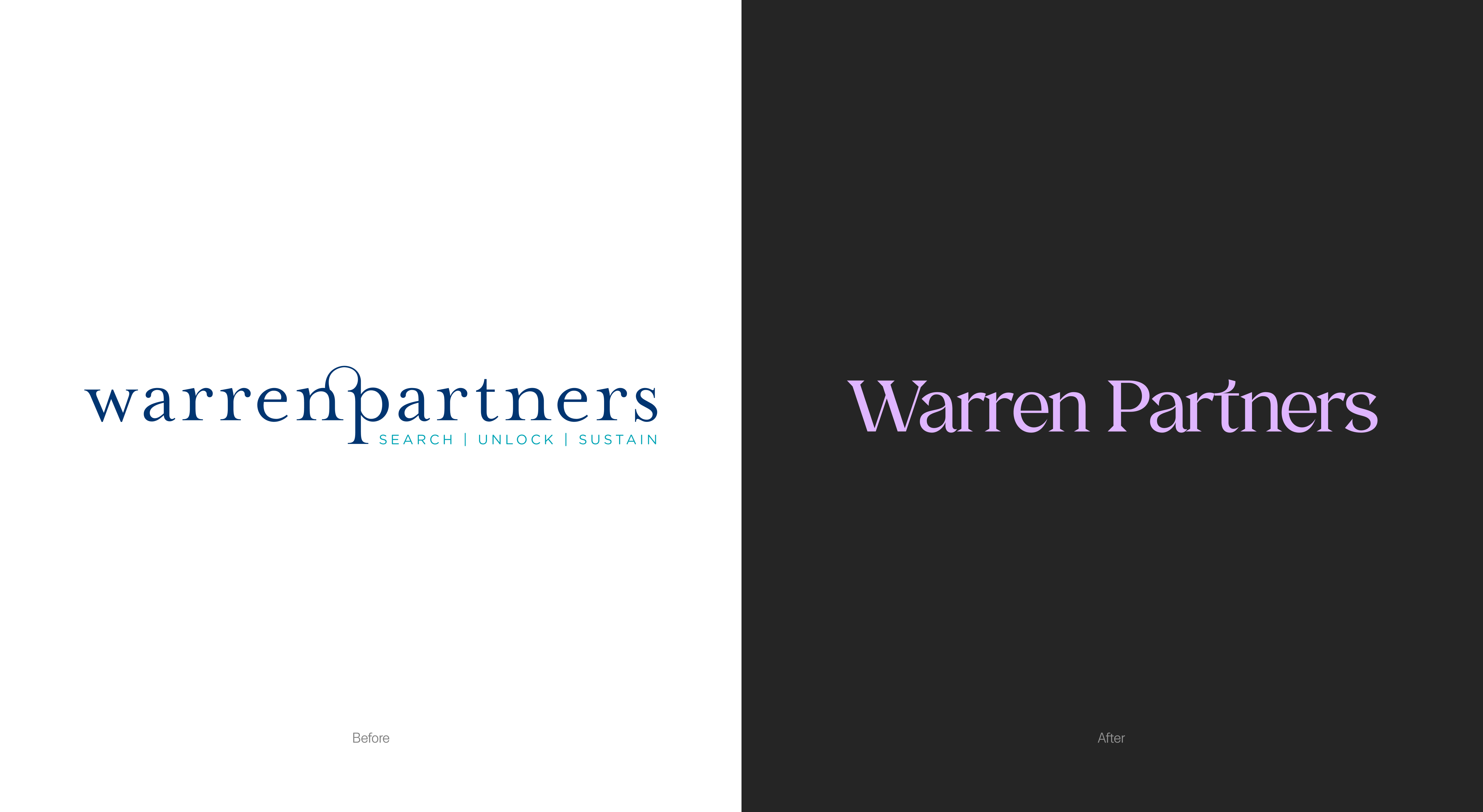
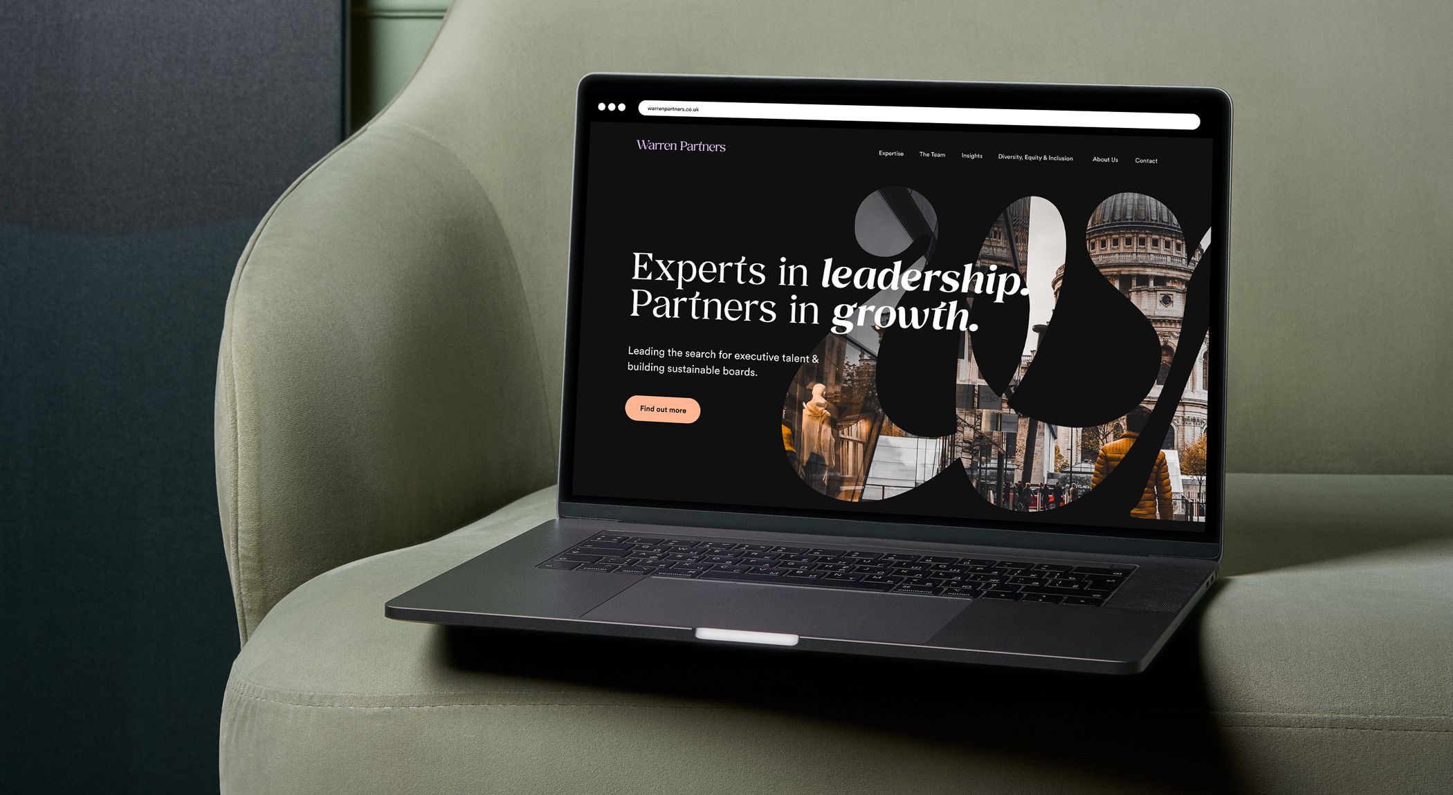
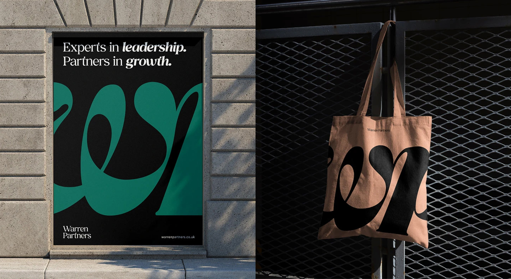
The chosen identity direction: "We Are The Partners", builds confidence through bold, abstract form while retaining the gravitas the sector demands. The WP logomark uses an anagrammed, bespoke letterform to create something immediately distinctive: a mark that rewards a second look, and subtly nods to the partnership and connection at the heart of what Warren Partners does.
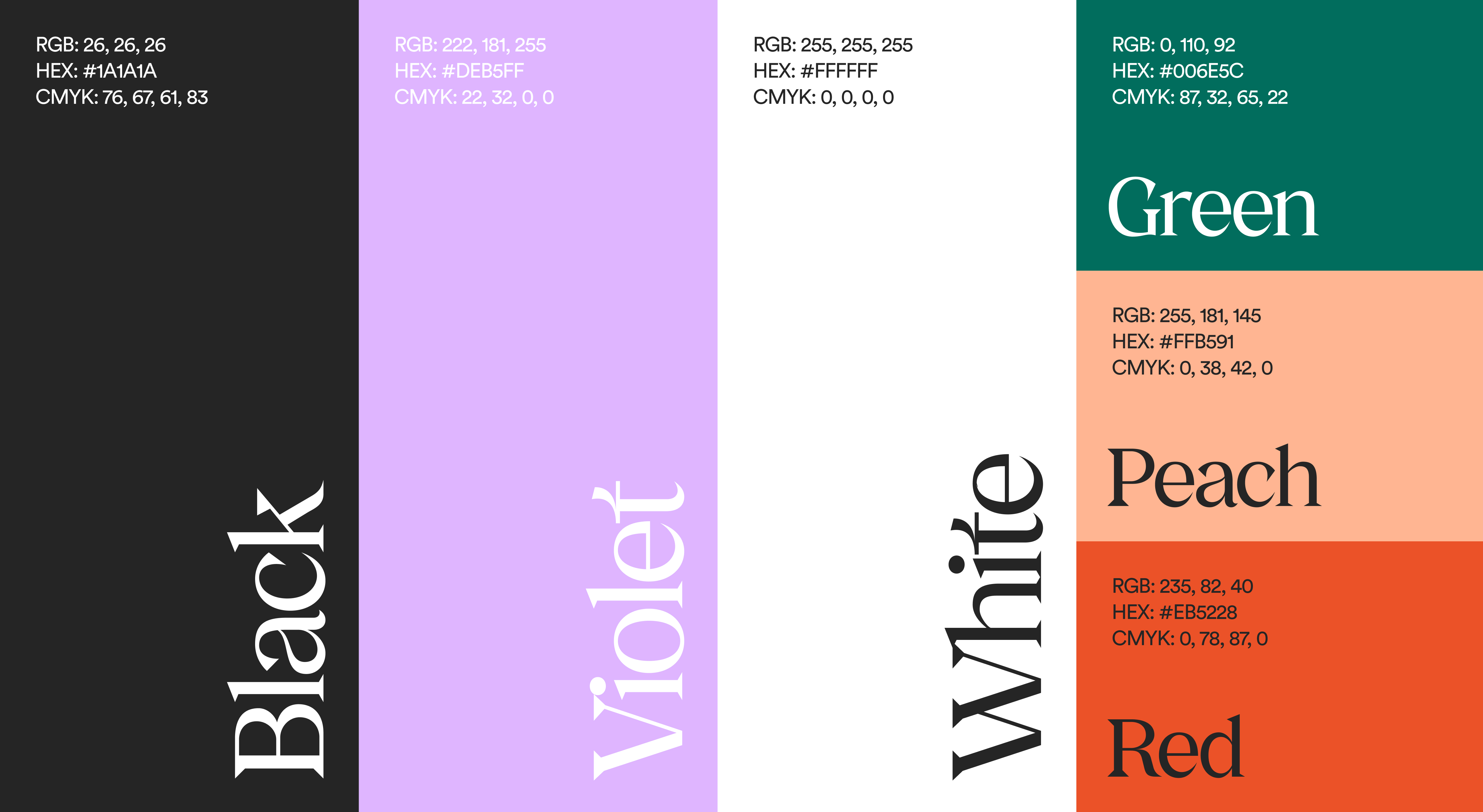
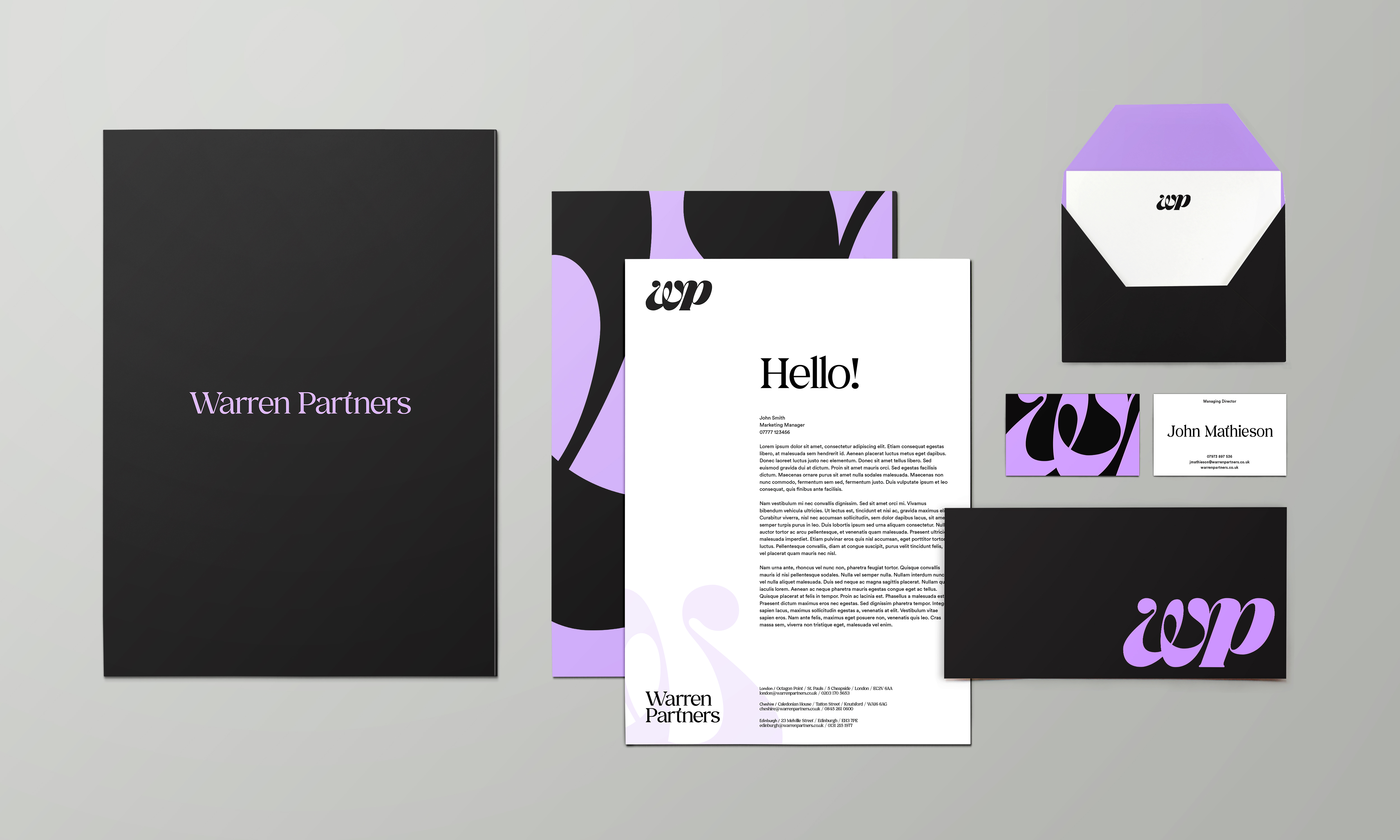
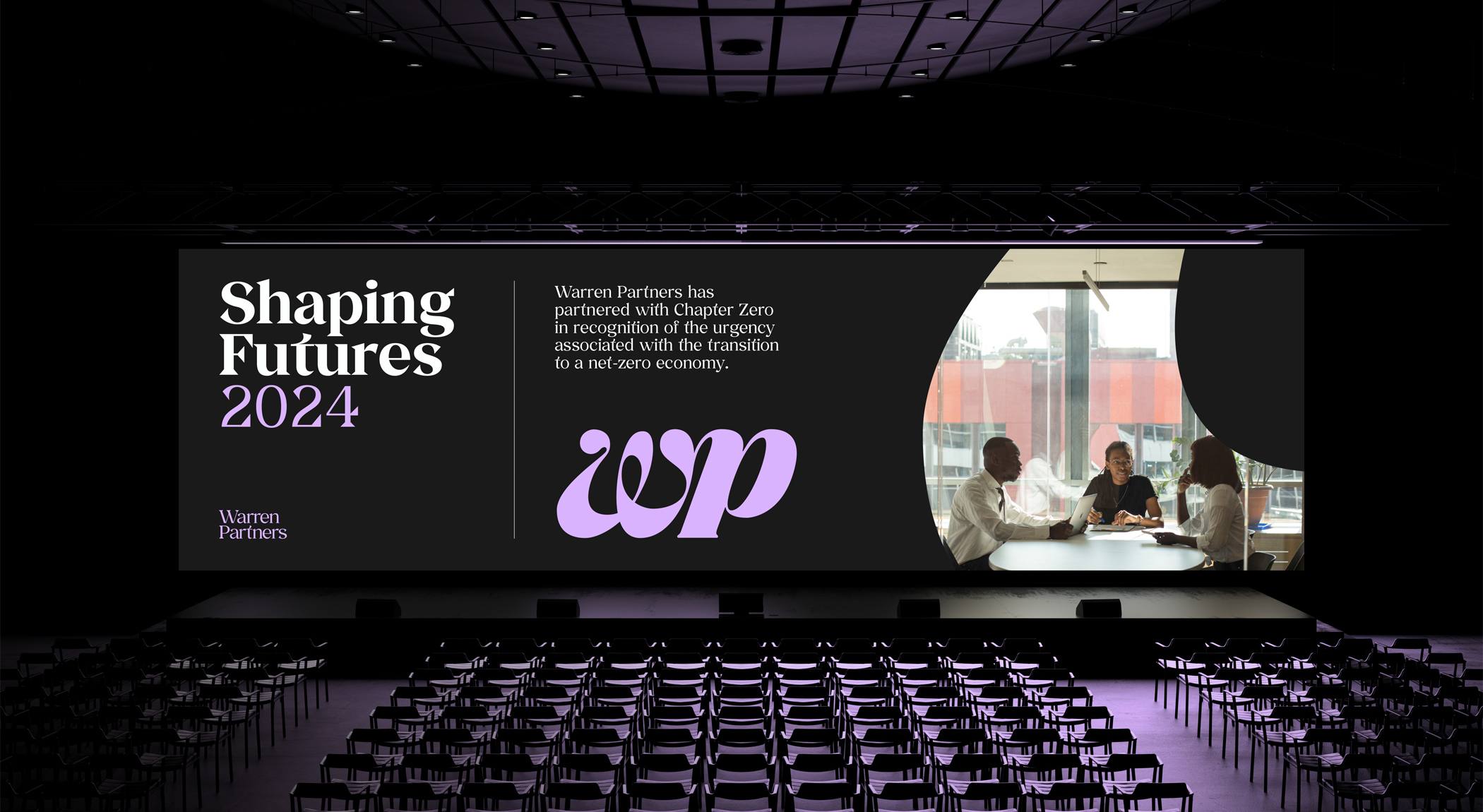
Overlaid serif type grounds the identity in heritage and trust without letting it tip into the predictable. A rich, considered colour palette, anchored by a deep teal and complemented by warm lilac and ochre accents, broke cleanly from the blue-dominated competitive landscape. The logomark doubles as a graphic device throughout the system: used as a lens to frame imagery and messaging, it speaks to the discretion Warren Partners brings to sensitive, high-stakes work.
The full brand system extended across website design, presentation templates, stationery, and social — giving the team a cohesive toolkit they could own and grow into.
The Outcome
Warren Partners came away with a brand that finally matched their reputation. One that could walk into a conversation with a FTSE 250 board and hold its ground. The maturity and confidence of the new identity opened doors to larger mandates, gave the team a stronger platform to champion their DE&I work, and signalled -clearly and without ambiguity - that this was not a firm content to be a well-kept secret.


.gif)


